Monday, March 24, 2008

South Shore Shooters


So anybody who thinks that a good nickname for a Gary, Indiana based sports team would be the Shooters, please raise your hand. Seriously, Andrew Haines and the rest of you team owners, you can put your hand down - you don't count.

And don't go defending it by telling me that it honors the local casinos, either. That's almost as bad as it's other connotation.

Wait, it's not actually in Gary? It's in Dyer, 10 miles away? Well that makes it soooo much better.

Oh yeah, and while we're at it, Dyer - enjoy your half season of ABAish hockey. Good luck with Mr. Haines there. He's never burned anybody.

Doesn't anybody do research before investing in sports franchises anymore?

Team: South Shore Shooters
League: Mid-Atlantic Hockey League - What a joke
Location: Dyer, Indiana - the greater Gary area
Arena: Midwest Training & Ice Center

Labels: ,


Friday, October 12, 2007

Port Huron IceHawks - UPDATED AGAIN!


Wow. Now that is on BAD logo. Seriously, I don't think there is anything left to say except...YUCK!


UPDATE - 7/27/2007...


And it just gets worse. For some reason, the IceHawks changed their colors to red and black. Why, I have no idea. I'd be wiling to bet it's because they got a good deal on red jerseys or had leftovers from the old Flags team that they can salvage. It's either that or they just want to capitalize on the Red Wings color scheme. Either way, it still stinks.


UPDATE - 10/12/07...

I've got to give it up to SLP commenter jonez who chimed in with "AM I the Only one seeing the word KINNEY within the iced tail feathers of the bird??" Good eyes jonez, I never even noticed that. You are absolutely correct, the word KINNEY is right there.

If you are wondering what that cryptic word means, it's pretty simple. Larry W. and Frank D. Kinney are the owners and president and governor respectively of the IceHawks. It explains so, so much.


Team: Port Huron IceHawks - or DrunkenParrots
League: International Hockey League - a few of the former UHL teams
Location: Port Huron, Michigan
Arena: McMorran Place

Picture stolen from the Port Huron Times Herald

Labels: ,


Wednesday, October 10, 2007

American Hockey League Logos

Running the risk of disparaging anybody's opinions, I have to post a rebuttal to the AHL top 10 and worst 10 logos lists that I just read over at Faceoff Factor.

The problem lies in how we judge logos. The criteria in his list are...

1. Does it associate well with the NHL affiliate?
2. Is it hockey related?
3. Can people recognize it from far away?

Using his criteria, I can understand his rankings. But for me, the only criteria that I would use of these three items is #3. I don't think that logos associating with their NHL affiliate is a very important factor. For the average fan of these teams, it doesn't make that much of a difference. And I really don't like it when they take the affiliates name and almost exact logo. It's boring and weak.

I also won't penalize a logo if it isn't related to it's sport. In fact, if a logo can be effective and get the point across without relating to the sport it can gain some big time points.

I still can't say that I have a specific criteria about how I judge logos. I just look at them and determine if they strike me as something I like or not. I wish I could boil it down a little bit more than that, but I just can't.

So, using my "criteria", here are my top five AHL logos. Why only five? Because I don't think there are 10 good logos in this league. I could do a top fifteen of my least favorite logos though but ten of those might tie for first place. Faceoff Factor rankings in parentheses.

5. Portland Pirates (5th on the Worst 10 list)


I can't say that I'm in love with this logo, but I do like Pirates and I do like that kind of coy, coniving look on the Pirates face. I can't believe that I have to pick this as my fifth favorite AHL logo. This league is brutal.


4. Houston Aeros (not ranked)


I love the idea of this logo. The bomber is very cool and the wordmark is interesting and different. However, I don't like how it's all put together. The flying through the puck thing is weird because it begs the question, "what happened to the wings?"


3. Toronto Marlies (1st on the Top 10 list)


I love the Toronto Maple Leafs logo, so that wins it big points automatically. But I'd prefer that they do something with the unique and historic Marlboro's nickname. But what are you going to do? They are owned by the Leafs. And I have to wonder why they need both the historic leaf and the current maple leaf logo (on the shield) on the same logo. Seems like overkill.


2. Grand Rapids Griffins (not ranked)


First of all, I love Griffins as a nickname, it's a totally unique name in all of professional sports. The wordmark is very well done, I love the two f's in the middle separating the city name and I love how it creates an arch. And that griffin is great. It's fierce but isn't scary and is both kid friendly and something that an adult would have no problem wearing it on a t-shirt.


1. Milwaukee Admirals (1st on the Worst 10 list)


Simply read my review of this logo. It has stood the test of time for me. One of my favorite logos period.

Labels:


Wednesday, October 03, 2007

Tournament of Logos

I just want to pass along a couple of links today, both related to each other.

The first is for the NHL Tournament of Logos, a blog and contest that recently wrapped up with the Montreal Canadiens taking the top spot over the St. Louis Blues logo. Not sure if I agree, but the public has spoken.

Now Chris, the tournament master, is launching the Tournament of Hockey Logos. He will start with either the AHL or the ECHL with voting in the first tournament opening on October 15th.

On his site right now he has posted all of the logos for both leagues and I have to say, the ECHL tournament is going to be the most interesting. While the AHL, to me, has a clear winner in the Milwaukee Admirals...


...The only logo that really stands out in the ECHL is the Victoria Salmon Kings...


...And I wouldn't choose it as the best logo, it just happens to be my favorite logo of the bunch, warts and all.

Anyway, it should be an interesting tournament and both of those sites are worth checking out if you have some time.

Labels:


Thursday, September 27, 2007

Alexandria Blizzard

Sometimes I find logos that, for whatever reason, I can't review. I don't know what it is about them, but they leave me speechless. I just simply have to post them and say "here's a logo for you...enjoy".

Such is the case with the Alexandria Blizzard of the NAHL. I don't know why, but it defies description.

Anyway, here's a logo for you...enjoy!


Team: Alexandria Blizzard
League: North American Hockey League
Location: Alexandria, Minnesota
Arena: Runestone Community Center

Labels: ,


Monday, September 24, 2007

Niagara IceDogs

Yikes, it's been a busy weekend. I had my best friend in town and we went to see his Washington State Cougars get blown the heck out of the water by USC. What an awful display they put on. We left at halftime and hightailed it to the Rose Bowl to see my Washington Huskies get blown the heck out of the water by UCLA. Kind of a brutal weekend of college football for us. Anyway, I haven't had much time, thankfully I have correspondents. Big thanks go out to John Baker for his review of another random logo. Expect more from him in the future...

When owners of a new minor-league franchise are at a loss for a new and clever name, there is a temptation to take any noun or adjective and simply stick the word “dogs” on the end of it. Sometimes, if the owners are feeling particularly clever or creative, they might change things around a bit and spell it “Doggs,” or, God help us, “Dawgs.” Thus, we have had inflicted on us Sea Dogs, Surf Dawgs, RiverDogs, Sun Dawgs, Beach Dogs, and Swamp Dogs, to name just a few.

Since one of my very own favorite teams ends its name with the word “Cats,” it is probably wise to point out that not all household pets are created equal. Some of these names are more clever than others. When the city of Memphis was angling for an NFL team some years ago, the proposed name was the Hound Dogs. That would have been a great name. Not only did it have an obvious connection to the iconic Elvis Presley song, but there really are hound dogs in Tennessee. When the owners of the Washington NBA franchise decided that Bullets was perhaps not the best name for a team located in a city with one of the highest rates of gun violence in the country, one of the proposed alternatives they came up with was Sea Dogs. This suggestion was met with laughter and derision, but at least the term already existed. If Washington, D.C. were located on the ocean, instead of some obscure river, and if the town was known for its maritime tradition, rather than for sex, lies and video tape, it might have worked. This would be a great name for a team located in Norfolk or Annapolis.

But some of these other alternatives are just silly. Surf Dogs and Beach Dogs bring to mind critters who make your local beach a hazardous place to walk. And if this is a women’s team we are talking about, would that make them the Beach Bitches? Come to think of it, that would be a pretty good name for, say, a roller derby team, but it would probably be a bit over the top for a team you might want to take your kids to watch.

This brings us to today’s entry, the Niagra IceDogs of the Ontario Hockey League, located in St Catharines Ontario. What exactly is an IceDog, anyway? Most dogs I am familiar with do not seem to care for ice any more than these other animals. Of course, there are those dogs in Alaska and Canada who run in those long races, but they are usually either referred to by their breed, most often Alaskan or Siberian Huskies, or are called sled dogs. Now, that wouldn’t be such a bad name for a team located in someplace like Fairbanks or Nome, but as far as I can tell, such hard working canines are not indigenous to southern Ontario. It seems an ice dog is just a dog with the word “ice” tacked on to the front of its name, and most dogs do not fair much better on ice than most people. They tend instead to get cold and fall down a lot, not the sort of image you would want for a hockey team. Some time this season, the IceDogs will take on their rivals the Sault Ste. Marie Greyhounds to determine the alpha male of the frozen canine set. Watch where you step, and don't eat that yellow snow!

So IceDogs is a dumb name. But perhaps the owners could get around that by coming up with a really compelling logo. How about a fierce or determined husky? How about some mean-looking critter biting through a hockey stick? How about a figure raising his hind leg above an opponents logo in a gesture of distain? Perhaps they could have, but alas, they didn’t. Instead, they came up with a cartoon-ish representation of a dog in a hockey uniform.

I am trying to figure out what I like about this logo, and the answer is, well, nothing really. There is nothing about it that tends to make it distinctive or connect it to the local community. It is just a dog in a hockey uniform. The drawing itself would not be bad if it were submitted as an assignment in a high school art class, but is otherwise nothing special. It is flat and two dimensional. It is not even clear whose uniform this bland pit bull-looking creature is wearing, as he has a big white X on his shoulder, which appears to be apropos of nothing in particular. The colors and word mark are not bad, but they are not especially compelling, either. The overall effect is just bland.

It doesn’t even make me want to bay at the moon in disgust, but instead to want to curl up on the floor and go to sleep. As logos go, I can hear this one barking.


Team: Niagara Ice Dogs
League: Ontario Hockey League
Location: St. Catharines, Ontario
Arena: Jack Gatecliff Arena

Labels: , ,


Thursday, September 20, 2007

Edmonton Oil Kings/Flin Flon Bombers


Holy crap, it's hockey season again? The Western Hockey League kicked off it's season with the return of the historic Edmonton Oil Kings franchise. In front of a Rexall Place crowd of 6,782, the Oil Kings did opening night up right posting a 4-3 victory over the franchise that last abandoned Edmonton, the Kootenay Ice.

Put the Oil Kings logo down as my favorite new/old logo released this year. Of course, I'm not sure that there were any other new/old logos released, but that's neither here nor there. The Edmonton Oilers owned Junior-A franchise did a little bit of work to update the classic Oil King logo, notably replacing the St. Georges Cross with an oil drop and the reworking of the colors. The results are exceptionally simple and...

Wait! We interrupt this review because The Sports Logo Pundit found something that blew his mind. While researching the Oil Kings I came across a jersey that automatically jumps up to the top of my all-time favorites...


That's Bobby Clarke and his jersey from when he was a member of the Western Hockey League's Flin Flon Bombers. The Bombers name and famous exploding "B" logo have been used by this strange sounding Manitoba city since 1936 without too many changes.

And would you believe it, the Flin Flon Bombers still exist as a part of the Saskatchewan Junior Hockey League. Unfortunately, this jersey isn't part of their current uniform, but even without it, they still look pretty darn good.


Team: Edmonton Oil Kings
League: Western Hockey League
Location: Edmonton, Alberta
Arena: Rexall Place

Team: Flin Flon Bombers
League: Saskatchewan Junior Hockey League
Location: Flin Flon, Manitoba - named after the character Josiah Flintabbatey Flonatin. Seriously.
Arena: Whitney Forum
Merchandise: Great game worn jerseys

Labels: , ,


Tuesday, September 18, 2007

Topeka Roadrunners

Tonight marks a step forward for The Sports Logo Pundit as I unveil our very first Correspondent. Thanks to Chris Roberts of Turning 25 for stepping up and tackling a pretty rank logo (IMO) that I chose at random for him. Look for more reviews in the future from Chris and other correspondents. For the guys that have emailed me and I haven't yet responded, don't worry, I'll get back to you this week.


Logos for sports teams are funny in that you almost always have to suspend belief when you approach them.

What do I mean? Well, without question we accept a smug leprechaun to front the Boston Celtics, and for the past couple of years we have tolerated a buffalo-slug hybrid to represent a team called the “Sabres.” Realism isn’t a thing of necessity when it comes to sports logos. When executed rightly, you don’t need to be realistic, either – see also “Iron Pigs” and “Cardinals, Arizona.”

The suspension of belief should come naturally, though, as if the logo itself compels you to just [cue whisper] believe. I shouldn’t have to get myself into the zone to buy into a logo.

Inside that zone today is the logo for the Topeka RoadRunners. The team from Topeka is originally from Santa Fe, New Mexico, where the RoadRunners moniker certainly passes better muster. This NAHL team is moving to Kansas’ capital this season after a grassroots movement among the city’s hockey fans to woo the team away from the land of enchantment.

Instead of a complete redesign, which a junior A hockey team probably couldn’t swing budget-wise, the RoadRunners are simply recoloring their logo and changing up the font in the word mark for the move. New this season are the golden-brown beak, changed from a much less natural blue, the silver color in the feathering, and a semi-serif-style font in place of the non-styled block-serif for the word mark.

Looking at the bulk of the logo, the roadrunner’s head, I’m first distracted by the whole “prehistoric” styling – the jagged black lines outlining the areas of color, the silver head-feathers sweeping up behind the beak to conjure imagery of mean, nasty horns or spikes (which you could easily mistake them for altogether at first glance).

Bothering me the most are the teeth – roadrunners don’t have teeth, so why make that such a prominent feature on your logo? Yes, it’s obviously a treatment to make the logo look meaner, but we’re back to the whole “forced suspension of belief” deal.

Plus, it’s an unnecessary liberty taken with the real bird’s morphology. Really unnecessary considering how successfully birds can be styled to look “mean” without adding teeth – see the Seahawks, the Ravens, and the aforementioned Arizona Cardinals.

Roadrunner head aside, the new font fits well and isn’t really all that bad. While I personally would stay away from a font like that, the style fits here pretty well.

While Topeka’s new, used hockey team comes with a refreshed logo that could be worse, it’s nowhere near the front of the pack, or flock if you want so badly that easy, easy pun. For that, I’m willing to give this guy a C+.


Team: Topeka RoadRunners
League: North American Hockey League
Location: Topeka, Kansas
Arena: Landon Arena
Mascot: Yes, it’s a roadrunner (surprise), but I can’t find his/her name anywhere!
Merchandise: Not online yet

Labels: , ,


Wednesday, September 12, 2007

Vancouver Canucks


The NHL season is fast approaching and if you didn't already know, the entire league is changing it's jerseys this season. They are going to a new, high performance jersey designed by Reebok. I don't even want to get into the new design and cut of the jersey other than to say that I dislike the whole idea, but at least it has given us something to talk about.

My favorite NHL team is the Vancouver Canucks simply because they were the closest to where I grew up and because I loved their logo. Growing up in the Pacific Northwest (near the Canadian Southwest) Orca whales are a big part of our culture and have a deeper meaning than they do anywhere else in North America. I appreciate their use in this logo, even if it has virtually nothing to do with the nickname Canucks (in fact, it had more to do with their old ownership group, Orca Bay Sports and Entertainment, but I'm fine with that). However, I wasn't sold on the burgundy in the old logo and I was happy to hear that they would be returning to the Canucks original blue and green color scheme with their redesign.

Unfortunately, they didn't bring any green into the recolored logo, and I don't know why. White, silver and navy don't make for a particularly striking logo, especially on this jersey. The green really stands out on the stripes and sleeves and on the alternate logo and it needs to be repeated on the crest. Combine the crest with the one color "Vancouver" text above it and you have a big colorless hole right in the middle of the jersey. It's disappointing that they fouled it up so bad in that respect because it could've been wildly successful.

The one thing that they did get right is the alternate logo. Basically it's just an update to their original primary logo...


It finally looks like a "C". It was too hard to quickly understand what they were getting at in the original. Although what I loved about the old stick in a hockey rink is that the Canucks were willing to celebrate one of the lamest logos of all-time.


Team: Vancouver Canucks
League: National Hockey League
Location: Vancouver, British Columbia
Arena: General Motors Place
Mascot: Fin
Merchandise: Replica jerseys keep getting more and more expensive.

Labels: ,


Tuesday, June 19, 2007

East Kentucky Miners & Indiana Ice Miners

The Sports Logo Pundit would like to welcome two of the latest teams to enter the minor league sports landscape: The East Kentucky Miners of the the Continental Basketball Association and the Indiana Ice Miners of the Mid-Atlantic Hockey League.


While it doesn't appear that anything is official, according to this article, former Miami Dolphins quarterback Jay Fiedler - an Ivy League graduate for what it's worth - and his business partner are planning on relocating the Florida Pit Bulls, a failed ABA team, to Pikeville, Kentucky to become the East Kentucky Miners of the CBA. This will be the second CBA team that Fielder's ownership group operates. The Indiana Alley Cats (who it doesn't appear have paid their web hosting bill lately) joined the CBA last season.


I'd be willing to bet that you have no idea what the MAHL is. Don't worry, I didn't either. The MAHL is a startup hockey league hoping to get off the ground in the fall. The Ice Miners of Indiana, Pennsylvania join the Mon Valley Thunder and the Wooster Warriors as the first three teams to be announced for the inaugural season.

When I first heard about the MAHL, I thought that it might be either a fake or a fantasy league, something seemed fishy about it. But after doing a little bit of research it appears that it's on the up-and-up. Operated by Andrew Haines, who also either runs or ran the American Indoor Football Association and the National Profesional Basketball League (two leagues with varying success. The AIFA just completed a relatively successful first season while the NPFL tried to have a season but crowned a champion in April after only six games), the MAHL will at the very least give it a go, but I wouldn't expect a high quality product on the ice. Minor league hockey is a tough nut to crack, just ask the UHL.

Now that we know the teams, there are so many questions that come to mind...
  1. "What are the odds that two of the newest professional teams have the Miners nickname?"
  2. "How is it possible that they could release such similar logos simultaneously?"
  3. "Which Miners logo is better?"
  4. "How will global climate change affect the mining of ice? "
  5. "Which team has the better chance of survival?"
  6. "Is Miners the most overused nickname in all of minor league sports?"
Here are the answers...
  1. 500-1
  2. Lack of creativity
  3. Doesn't matter, they are both ripoffs of many other logos. Maybe a slight edge to the Ice Miners because their wordmark is pretty cool.
  4. It has gotten so bad in the ice mining industry that they had to retrain them to play hockey.
  5. The CBA is on iffy ground, but Jay Fiedler signed some pretty hefty contracts as a football player and probably has more money to waste. Plus I still have my doubts that the MAHL will ever play a game.
  6. Now it is.

Labels: , , ,


Tuesday, April 10, 2007

Lewiston MAINEiacs - Update!

First of all, I'll get back to reviewing logos shortly. I've been out of town, finishing up the taxes, generally slacking and nothing has caught my eye over the last couple of days. But I've noticed a couple of new logos that are begging to be reviewed so we'll get this bad boy rolling again this week.

One of the first logos that I reviewed was the Lewiston MAINEiacs of the QMHJL. I like to try to keep up with the teams that I have reviewed over the years but somehow I missed out on the MAINEiacs alternate jersey...


I'm not sure what to think of it. It's both awesome and horrible for the exact same reasons. But since this is an alternate jersey for a junior hockey team, I'll go ahead and proclaim that it's awesome. If it were an NHL jersey, I would have to side with horrible. It's all about context with me.

Unfortunately, I noticed these much too late and it appears that they only have adult smalls left in their team shop. So if you are one little tiny hockey fan, you can buy one by clicking here. Enjoy teeny weeny.

Labels: ,


Wednesday, January 24, 2007

Brandon Wheat Kings


Brandon, Manitoba. One of the greatest city's in the world with a wonderful and beautiful name that when spoken, rolls off of the tongue and straight into god's ears.

And what is the greatest hockey team in whole world? Obviously it's the Brandon Wheat Kings of the Western Hockey League. Despite the fact that the logo above is an updated version of a Wheat Kings logo used in the 1980's that nicely ties modern design with that classic, historic look, the Wheat Kings logo has one big problem, or in this case, a little problem. Why in the world is the name of the city so darn small? Shouldn't the name Brandon be celebrated? Shouldn't it be gigantic? Personally I would prefer a humongous Brandon script with Wheat Kings relegated to secondary status.

Whatever, I'll take what I can get. This is the first time in the franchise's 4o year history that the city name is featured in the primary logo. Maybe the next time they change the logo, Brandon will take over completely. One can only hope.

Team: Brandon Wheat Kings
League: Western Hockey League
Location: Brandon, Manitoba
Arena: Keystone Centre
Mascot: I think he's named Wheatie
Online Store: You gotta love those jerseys with the wheat stripes

Labels: ,


Tuesday, January 09, 2007

Texas Tornado

Does a junior hockey league team lose something when it's owned and operated by a big, important sports marketing firm that comes complete with their own Pyramid? Perhaps it does lose some of it's independent spirit. But what it loses in hometown pride it makes up in shiny, well developed logos!

The Texas Tornado are owned by Schlegel Sports, who also owns the Iowa Stars of the AHL and the Triple-A Tacoma Rainiers baseball team. They play their home games at the same facility that houses the Dallas Stars practice arena and have close ties to Hicks Sports. The Tornado are well financed, well connected and have been uber-successful since their inception in 1999.
The logo is simple, especially for a Texas based team, and does an excellent job of working in the Stars theme without being called the Junior Stars. The color scheme is unique in that it features only two colors other than white, which again is a major coup for a Texas team especially since those two colors aren't red and white.

My only complaint is that they are the Tornado and not the Tornadoes. It's a totally different connotation without the "es". Although after typing Tornadoes, I can see why.

Team: Texas Tornado
League: NAHL - National Champions 2001, 2004, 2005 and 2006
Location: Frisco, Texas
Arena: Dr. Pepper StarCenter
Online Store: Decent logo, ugly jerseys for sale.

Labels: ,


Tuesday, October 17, 2006

Cedar Rapids RoughRiders


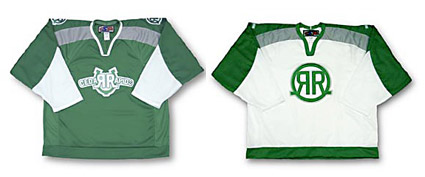
Now those are hockey jerseys! The Cedar Rapids RoughRiders sport some of my favorite jersey logos in all of hockey. I like the wordmark on the home (green) jersey with the backwards "R" in Cedar and the "R" in Rapids. But I love the simple "RR" brand logo that is sported on the road (white) jerseys. I just wish that they sported the brand as the primary logo on both of the jerseys available for sale in their e-store, although it looks like it is on the shoulders of the home jersey.

But then I found the horse logo (right ) on their website and now I just feel bad for that poor, broken pony. I think it is supposed to be bending over to take the faceoff, but it looks more like they have just put him down and he is ready to be dragged off to the glue factory. And, to get really nitpicky, couldn't the logo on his jersey be the brand? Does this team need any more logos?

Unfortunately, it kind of looks like the horse logo has taken over as their primary logo complete with it's own alternate jersey. Then again, it looks like every logo at some point has had it's own jersey in every different color imaginable. I have no idea what they are actually wearing this season. I just hope they wise up and start using the brand logo on everything.

Labels: ,


Saturday, August 05, 2006

Milwaukee Admirals


Could this really be the most hated logo in all of America right now? No, but it does seem to be running a close second only to the disaster that is the new Buffalo Sabres logo (a hot topic for another day).

The Milwaukee Admirals wanted to make a big splash with their new logo, really shake things up for this minor league team in a major league city. And that they did, creating a logo that immediately elicited the ire (or iiiiiiire - sorry) of the local hardcore hockey community, the logo nerds on the Sports Logo Forums and even Uni Watch.

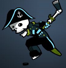
But has it drawn the ire (iiiiiirrrre) of The Sports Logo Pundit? Hell no, this logo is awesome! It's one of my absolute favorites that I have reviewed. But I love pirates, I love cartoons and I love the severed leg hockey stick.

I know that I'm not very consistent about what I like and don't like. I've ripped a lot of logos with the same cartoonish quality, but something about this one just works for me. It's cool and fun and I think it will be ridiculously popular in the long run, especially with the kids.

Sometimes as a minor league operator you have to make tough choices and the Milwaukee Admirals made one. I'm sure that they knew that the hardcore, traditional hockey fans were going to react negatively to the logo at first. But I'm also sure that they did their homework and know that it will be hugely popular with casual hockey fans that are going to bring their friends, spouses and kids to games. If the kids have a good time, and the pirate theme will help immensely with that, you can bet that the entire group will be back. This is how you create new, hardcore hockey fans.

The current traditional, hardcore hockey fans won't really drive to Madison or Chicago for their hockey, regardless of what they say now. Once the season rolls around there won't be any boycotts. They will probably be the first in line for jerseys (especially if they have kids). The amount of fans that the Admirals will lose because of this logo is negligible. The amount of fans that they could win with it is much higher.

Besides, if you look close at the jersey, check out the bone anchors. Very cool! I can't wait to get a t-shirt, maybe even a jersey? It's August 5th, isn't it time you started your Christmas shopping?

Labels: , ,


Saturday, June 24, 2006

Anaheim Ducks


In an effort to distance themselves from Disney and Emilio Estevez (where the heck is he?), the Mighty Ducks of Anaheim are no longer Of. Or Mighty, either, I guess. Instead, they are just the plain old, boring Anaheim Ducks.

On Thursday, the Samueli family unveiled the new Duck's logo and jerseys. The good news is that they have ditched the trendy early 90's teal and eggplant color scheme and replaced it with the trendy early 00's black, metallic gold and orange color scheme. Gone is the duck billed goalie mask, in is a web footed "D" and a bold "Anaheim Ducks" script.

I have no big problem with this logo. But it's not very exciting or interesting. It's another example of a team that had a great opportunity to really make an impact with something ground-breaking and unique, but they played it safe and went with something that is just OK. The best I can say about it is, it will do.


My real problem, though, is with these jerseys and the lack of a striking logo on the chest. I've said it before, but my favorite hockey jerseys have a crest on the front, a graphic representation of the team, not just text. I don't want to have to read.

I always liked the goalie mask, but hated the colors. They kept their mascot Wildwing, who is modeled after the old jerseys, why couldn't they keep the goalie mask and spruce it up a bit if they weren't planning on hitting a homerun with a new logo? At the very least use it as a secondary logo.

The goalie mask, to me, was one of the most unique and recognizable logos in sports. I could spot a Mighty Ducks jersey from a hundred yards away and I knew that it was a Mighty Ducks of Anaheim jersey. I understand their want to move away from the Disneyization of the logo, but why throw away such an important and identifying symbol for the team?

I'd have to think a secondary logo and third jersey are on their way. When they finish milking the sales on new black and white primary logo jerseys, they will introduce the alternate. Hopefully the goalie mask will make a triumphant return upon their release.

I'm not the only one who thinks this way, the Duck's Message Boards are on fire with a mutual Meh, and a resounding vote of confidence for Wildwing and the mask.

Labels: ,


Tuesday, April 18, 2006

Houston Aeros


First of all, go check out my renter for the week, Deep Fried Fish Blog, a pretty good blog all about the Florida Marlins.

I have been pretty harsh to the City of Houston since The Sports Logo Pundit returned a few months ago. First it was the Houston 1836 then the Houston Dynamo and reports of just how squalid that city is.

But for once I have nothing bad to say about the City of Houston other than it is an awful, terribly disgusting, ridiculous city full of idiots. Instead I have positive news. The Houston Aero's have a new logo, and I like it.

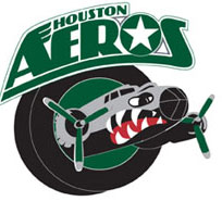
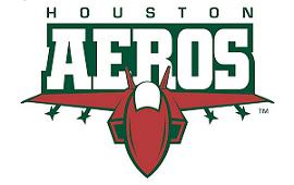
Well, it isn't such a new logo, they just jettisoned their latest logo (no pun intended) in favor of their previous logo. And actually they haven't completely jettisoned the fighter jet (shown below), it is just going to be their alternate logo. Confusing, isn't it?


Most hockey logos, in my opinion, are best when they are rounded rather than angular. The fighter jet logo is too pointy, not to mention the extremely boring font that they used in the logo overpowering script.

The "Bomber" logo (the new, old one) is nice and rounded, almost to a fault (how are the wings going to fit through the puck? Oh the horror!). Plus the font is very creative and different, and I absolutely love the look of WWII B-52 B-17 bombers.

Either way the Aeros can't lose. Marketing to the conservative, patriotic base is a shrewd move in Houston. An American military logo, no matter what it looks like, can't go wrong.

Labels: ,


Sunday, March 26, 2006

St. John's Fog Devils


Tonight I found one of my favorite new logos and bar none, my favorite hockey mascot.

St. John's, Newfoundland was awarded an expansion franchise by the QMJHL (or LHJMQ for all of you French Canadians)in 2004. After months of contentious negotiations the team finally signed a lease to play at Mile One Stadium for the 2005-2006 season and promptly held a name-the-team contest. The winning entry: The Saint John's Fog Devils. The logo: The dark lord himself. God bless Canada.

If the Fog Devils played in the United States, there is absolutely no way this logo is ever used. The powers that be running the team would never green light a logo with an image of Satan as the primary feature. Play it safe. Shoot for the middle. A sense of humor is overrated. Fierce but cute and non-threatening, that's what they want.

And if they did green light it, the uproar from the churches would make them change their minds in five minutes. It would be an outrage, a slap in the face, a mockery of the church. A false sense of persecution and righteousness would drown out everything else and the owners would have to retreat to something safe like the Dynamo (I know I whined about the 1836. I'm being a bit hypocritical, but they did cave those big weenies).


But this is Canada and they have much more to worry about than the fact that the local hockey team has a devil as their mascot, like not freezing their little toes off. It's a much more laid back and relaxed atmosphere up there, not everything is taken as an affront and an insult. They have a good sense of humor and are able to laugh at themselves. A Newfoundland winter would be very difficult to get through without being able to do so.

So thank you to the owners of the Saint John's Fog Devils for green lighting this wickedly awesome and fun logo and for bringing Scorch into the lives of hockey fans across Newfoundland. I'll be rooting for you to take out the Cape Breton Screaming Eagles and their dull, clipart logo. Go Devils!

Labels: , ,


Tuesday, March 21, 2006

Syracuse Crunch


Welcome to everybody stopping by from Dave's Unofficial Syracuse Crunch Page. Thanks for stopping by the Sports Logo Pundit. I'm not sure if you will see this page because you are directed to one of the archive pages, but welcome to the big show anyway.

I just have one question for all of y'all. Do you like the Syracuse Crunch logo? I know that it has been their logo for quite some time, at least it has been since I spent some time in Ithaca visiting my future wife at college six or seven years ago now.

I always saw the Crunch logo and, quite honestly, thought it was unprofessional. It doesn't scream high level minor-league hockey, it reminded me more of a junior hockey logo that was done on the cheap, maybe by one of the players themselves. I think the reason that I never went to a game in Syracuse was that I thought the Crunch seemed bush league because of their logo and that it wouldn't be worth the trip north.

Now, after reading some more about the Crunch and Al the Ice Gorilla, I like it a little bit more just because of how goofy it is. Seriously, Al the Ice Gorilla? What is that all about? Somebody please explain. Actually, maybe I don't want to know. Sometimes the more random and pointless the mascot, the better. Some mascots look like they were born from a focus group. Al looks like he was born out of some intern who, over beers at the bar after work, said "we should have a gorilla as our mascot", and someone actually listened to him.

No matter what, I can tell that the Crunch have some pretty solid fans. Any minor league team's unofficial message board that can give me that many hits in a given day must have some dedicated fans. But would you like to see a different logo for your beloved Crunch? Please leave me a comment and let me know what you think.

Labels: ,


Wednesday, March 01, 2006

Marquette Rangers


Michigan's Upper Peninsula has a new hockey team. The Marquette Rangers will join the Junior-A North American Hockey League for the 2006-2007 season playing in the city's Lakeview Arena. Marquette is a hockey town through and through with incredible high school hockey, the Northern Michigan University Wildcats and now the Rangers.

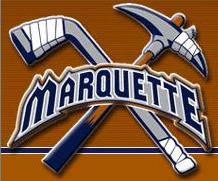
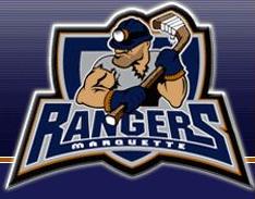
It is also a big mining town and the Rangers have done a great job of capturing that part of the area's culture in their logos. Both logos show exactly what Marquette is all about, mining and hockey. The first logo is great, simply because I love the crossed hockey stick and pick. The crossed sticks goes a long way with me in any logo.


But of course a team has to have a mascot so along comes this dude. Unfortunately they picked the most generic looking guy, you could easily trade out the hat and create any number of different logos. And I have said it before, but I will say it again - why can't we get some eyes on these mascot logos? What is it about the eyes that are so difficult? Are they so hard to draw that design companies charge more for them?

But what caught my eye about the Rangers is their ubiquitous use of slogans. On the front page of their website are two outstanding slogans...

"Life is short, do what makes you happy, watch Rangers hockey"
"Hockey with American ingenuity, Canadian grit and European flare"

But may I suggest a slogan that might work a little bit better...

"The Wildcats aren't playing and its ten below outside. What the hell else are you going to do in Marquette,Michigann?"

That would get me into the arena any day, because it's true.
Labels: ,