
Cedar Rapids RoughRiders
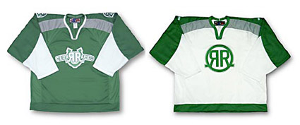
Now those are hockey jerseys! The Cedar Rapids RoughRiders sport some of my favorite jersey logos in all of hockey. I like the wordmark on the home (green) jersey with the backwards "R" in Cedar and the "R" in Rapids. But I love the simple "RR" brand logo that is sported on the road (white) jerseys. I just wish that they sported the brand as the primary logo on both of the jerseys available for sale in their e-store, although it looks like it is on the shoulders of the home jersey.
 But then I found the horse logo (right ) on their website and now I just feel bad for that poor, broken pony. I think it is supposed to be bending over to take the faceoff, but it looks more like they have just put him down and he is ready to be dragged off to the glue factory. And, to get really nitpicky, couldn't the logo on his jersey be the brand? Does this team need any more logos?
Unfortunately, it kind of looks like the horse logo has taken over as their primary logo complete with it's own alternate jersey. Then again, it looks like every logo at some point has had it's own jersey in every different color imaginable. I have no idea what they are actually wearing this season. I just hope they wise up and start using the brand logo on everything.
But then I found the horse logo (right ) on their website and now I just feel bad for that poor, broken pony. I think it is supposed to be bending over to take the faceoff, but it looks more like they have just put him down and he is ready to be dragged off to the glue factory. And, to get really nitpicky, couldn't the logo on his jersey be the brand? Does this team need any more logos?Unfortunately, it kind of looks like the horse logo has taken over as their primary logo complete with it's own alternate jersey. Then again, it looks like every logo at some point has had it's own jersey in every different color imaginable. I have no idea what they are actually wearing this season. I just hope they wise up and start using the brand logo on everything.
posted by Brandon @ 11:14 PM
![]()
![]()


1 Comments:
Actually the horse logo was the original logo. We had some ownership problems and the boring RR logo was introduced by an owner that actually bought the team with fake money. Fans didn't really buy into the RR and they brought back the original logo (which myself I really like). The only problam I have with the logo is the horse has hands holding the stick. Kind of creapy if you ask me.
Post a Comment
<< Home