Tuesday, December 04, 2007

Vancouver 2010 Olympics Mascots


Have you seen the 2010 Olympic mascots yet? I know I'm a little bit late - these were released last week - but I love Quatchi, Sumi and Miga - they are really cute. I'm so going to buy the set of all three for my kid (maybe kids by that point). And they have a cool website too! It should come as no surprise to anybody that knows me that the mascot that I'm most like is Quatchi...


Labels: ,


Wednesday, September 12, 2007

Vancouver Canucks


The NHL season is fast approaching and if you didn't already know, the entire league is changing it's jerseys this season. They are going to a new, high performance jersey designed by Reebok. I don't even want to get into the new design and cut of the jersey other than to say that I dislike the whole idea, but at least it has given us something to talk about.

My favorite NHL team is the Vancouver Canucks simply because they were the closest to where I grew up and because I loved their logo. Growing up in the Pacific Northwest (near the Canadian Southwest) Orca whales are a big part of our culture and have a deeper meaning than they do anywhere else in North America. I appreciate their use in this logo, even if it has virtually nothing to do with the nickname Canucks (in fact, it had more to do with their old ownership group, Orca Bay Sports and Entertainment, but I'm fine with that). However, I wasn't sold on the burgundy in the old logo and I was happy to hear that they would be returning to the Canucks original blue and green color scheme with their redesign.

Unfortunately, they didn't bring any green into the recolored logo, and I don't know why. White, silver and navy don't make for a particularly striking logo, especially on this jersey. The green really stands out on the stripes and sleeves and on the alternate logo and it needs to be repeated on the crest. Combine the crest with the one color "Vancouver" text above it and you have a big colorless hole right in the middle of the jersey. It's disappointing that they fouled it up so bad in that respect because it could've been wildly successful.

The one thing that they did get right is the alternate logo. Basically it's just an update to their original primary logo...


It finally looks like a "C". It was too hard to quickly understand what they were getting at in the original. Although what I loved about the old stick in a hockey rink is that the Canucks were willing to celebrate one of the lamest logos of all-time.


Team: Vancouver Canucks
League: National Hockey League
Location: Vancouver, British Columbia
Arena: General Motors Place
Mascot: Fin
Merchandise: Replica jerseys keep getting more and more expensive.

Labels: ,


Tuesday, July 12, 2005

Vancouver Canadians

Simplicity goes a long way with me. I think that baseball logos were much better and had a lot more character when teams were forced to be creative with just two letters of the alphabet rather than employ a crack staff of artists at a moments notice. What are the timeless baseball logos? "NY" on the Yankees caps, "D" for Detroit, "B" for Boston and going more modern the "A" with a halo for the Angels. It's very easy to forget some of the gimmicky mascot logos, but classically styled letter logos never go out of style.

So when I saw the Vancouver Canadians new logo for this season I was very happy. The Canadians have always done a good job of keeping their logos fairly simple and dignified but their last logo was a modern looking "VC" that never really looked right. Something about it made it look top heavy and awkward. Now they have a simple looking "C" on their home hats and a "V" on their road and both look very classy.

And the decision to use and embrace just the letter "C" on the logo makes perfect sense. The Canadians have been known throughout their existence in Vancouver as simply the "C's". In fact, when I went to my first game up there I had to stop and ask directions to the ballpark and I referred to the team as the Canadians. The guy was a bit confused, because any game up there is a Canadian's game. But he finally said "oh...You mean the 'C's'!" and sent me on my way.

So kudos to the Canadians for giving us a classic and dignified new logo to go with your classic and dignified jewel of a stadium in your classic and dignified city.

Labels: ,


Sunday, January 30, 2005

Vancouver Giants vs. Kelowna Rockets

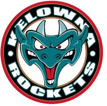
Saturday the Sports Logo Pundit spent the day up in beautiful but rainy Vancouver, British Columbia shopping at the awesome Granville Island Public Market, browsing around Chinatown and attending a Vancouver Giants vs. Kelowna Rockets hockey game. A fun time was had by all and it brought up the burning question, which team has the better logo?


But first, the game. Without the NHL the junior class Western Hockey League's Giants are the only game left in town and Vancouverites (Vancouverinians? Vannys? Couvs?) are foaming at the mouth for the chance to see any hockey. Thus, 11,000+ fans packed the Pacific Coliseum (the Canucks former arena before GM Place opened) for this tense matchup and they witnessed a great hockey game between two hard hitting and pissed off teams. Kelowna ended up winning the game 2-1 with a goal late in the third period but not before getting the tar beat out of them by some bone crushing Giant hits and one particularly brutal fight.

It was also Las Vegas night at the Coliseum and one lucky fan won a free trip to Vegas. Unfortunately it wasn't me who won the trip but I still got to get my picture taken with a couple of showgirls. It was kind of shocking to see them hanging out at a hockey game. I'm still surprised Death? let me pose for a picture with them. Thanks honey!

Anyway, on to the logos. I'm a huge fan of the Kelowna Rockets logo and have been since I figured out what that silly dragon was. What you may ask does that funky looking dragon have anything to do with Rockets or Kelowna? Well let me tell you. That dragon you are referring to is none other than Lake Okanogan's legendary sea creature Oggopoggo. Simply put, he's a Canadian Loch Ness Monster. It doesn't have much to do with the name Rockets but whatever, it works for me. It makes for a very cartoony logo that kids will love but still looks fierce enough that adults would be happy to wear a jersey or shirt with him on it.

The Giants logo is alright. The color scheme looks great on the jerseys and on their merchandise but the lumberjack character just doesn't have much life. I didn't even realize that he was supposed to be a lumberjack until I saw their mascot at the game. They subtly named him "Jack" to get the point across. I think it would make more sense if he was named "Paul" but what can you do?

So what do you think? Who has the better logo? Is it the Kelowna Rockets or the Vancouver Giants. The Rockets may have won the game but will they win the logo battle. Please place your vote in the comments section below. Thanks!

Labels: , ,