
Syracuse Crunch
Welcome to everybody stopping by from Dave's Unofficial Syracuse Crunch Page. Thanks for stopping by the Sports Logo Pundit. I'm not sure if you will see this page because you are directed to one of the archive pages, but welcome to the big show anyway.
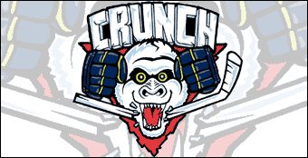
I just have one question for all of y'all. Do you like the Syracuse Crunch logo? I know that it has been their logo for quite some time, at least it has been since I spent some time in Ithaca visiting my future wife at college six or seven years ago now.
I always saw the Crunch logo and, quite honestly, thought it was unprofessional. It doesn't scream high level minor-league hockey, it reminded me more of a junior hockey logo that was done on the cheap, maybe by one of the players themselves. I think the reason that I never went to a game in Syracuse was that I thought the Crunch seemed bush league because of their logo and that it wouldn't be worth the trip north.
Now, after reading some more about the Crunch and Al the Ice Gorilla, I like it a little bit more just because of how goofy it is. Seriously, Al the Ice Gorilla? What is that all about? Somebody please explain. Actually, maybe I don't want to know. Sometimes the more random and pointless the mascot, the better. Some mascots look like they were born from a focus group. Al looks like he was born out of some intern who, over beers at the bar after work, said "we should have a gorilla as our mascot", and someone actually listened to him.
No matter what, I can tell that the Crunch have some pretty solid fans. Any minor league team's unofficial message board that can give me that many hits in a given day must have some dedicated fans. But would you like to see a different logo for your beloved Crunch? Please leave me a comment and let me know what you think.
posted by Brandon @ 12:19 AM
![]()
![]()


3 Comments:
test
silly one. looks more like a deranged and rabid racoon to me than a gorilla.
Good post, but you didn't get into the biggest reason why the logo looks bush league: It was originally supposed to have Al breaking the stick over his head (hence the gloves up near his eyes), but it was designed at about the same time Marty McSorley whacked Donald Brashear upside the head with his stick and the stick-over-the-head motif was deemed to be in bad taste. Unfortunately, while they moved the stick down to his mouth to make it look like Al was biting it in half, they forgot to move the gloves down to match.
Post a Comment
<< Home