
Jamestown Jammers
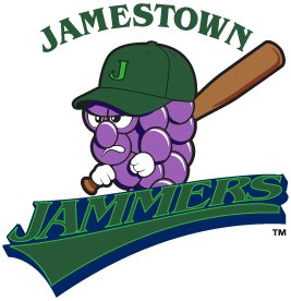
I don't know how this new logo for the Jamestown Jammers of the New York-Penn League slipped under my radar for so long, but now I long for those carefree days of sweet, ignorant bliss.
The Jammers had a pretty awful logo to begin with, but you would expect that with change would come improvement. Sadly, that is not the case. I thought that minor league baseball had progressed past these cheap looking designs. There have been some bad, cartoony logos introduced over the past few years, but at least they look professionally done.
This is, without a doubt in my mind, the worst logo in baseball and it rivals the Charlotte Krunk for the worst logo reviewed on the SLP. Please, let us put this logo behind us and move forward to bigger and better things. I encourage the Jammers to do the same thing.
Labels: Baseball, New York, Worst Logo Ever
posted by Brandon @ 1:13 AM
![]()
![]()


6 Comments:
O... M... G...
That is an abomination of a crappy logo. I much prefer the older one... at least the colors hod contrast so you could READ the name of the team! The blue and green have too similar of a color tone, and the fine lines in the typeface make this logo nearly impossible to identify from a distance. This does not look professional at all.
Grape jelly? Seriously?
In defense of the name in combination with the logo, they do grow a ton of Concord grapes in the Jamestown area. It is their biggest crop. But there is still no defense of this logo.
The mascot looks like it woke up at 4am and picked up the bat when he heard someone russlin outside his house.
Seriously, what the hell? This is supposed to be a "Jammer"? Not that the old logo was any better in that regard. "Jammers" is a dumb name anyway. Accordingly to Wikipedia, the name was selected by fan vote, which just goes to show that fans should never be allowed to choose anything more consequential than hot-dog toppings.
Although considering that the Jammers share a league with the Batavia Muckdogs, State College Spikes, and Mahoning Valley Scrappers, I suppose it's par for the course, name-wise.
Another team name ruined by fan vote? The New Hampshire Primaries. Honestly, the Uncle Sam with the baseball bat was the coolest logo, hands down. I don't even live around there, nor have I heard of the team, but I really want one of the hats!
IIRC the Jammers orig logo looked more than a little bit like the Tasmanian Devil. Was Warner Bros. threatening to sue?
Post a Comment
<< Home