Saturday, August 05, 2006

Milwaukee Admirals


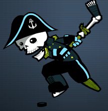
Could this really be the most hated logo in all of America right now? No, but it does seem to be running a close second only to the disaster that is the new Buffalo Sabres logo (a hot topic for another day).

The Milwaukee Admirals wanted to make a big splash with their new logo, really shake things up for this minor league team in a major league city. And that they did, creating a logo that immediately elicited the ire (or iiiiiiire - sorry) of the local hardcore hockey community, the logo nerds on the Sports Logo Forums and even Uni Watch.
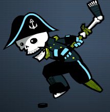
But has it drawn the ire (iiiiiirrrre) of The Sports Logo Pundit? Hell no, this logo is awesome! It's one of my absolute favorites that I have reviewed. But I love pirates, I love cartoons and I love the severed leg hockey stick.

I know that I'm not very consistent about what I like and don't like. I've ripped a lot of logos with the same cartoonish quality, but something about this one just works for me. It's cool and fun and I think it will be ridiculously popular in the long run, especially with the kids.

Sometimes as a minor league operator you have to make tough choices and the Milwaukee Admirals made one. I'm sure that they knew that the hardcore, traditional hockey fans were going to react negatively to the logo at first. But I'm also sure that they did their homework and know that it will be hugely popular with casual hockey fans that are going to bring their friends, spouses and kids to games. If the kids have a good time, and the pirate theme will help immensely with that, you can bet that the entire group will be back. This is how you create new, hardcore hockey fans.

The current traditional, hardcore hockey fans won't really drive to Madison or Chicago for their hockey, regardless of what they say now. Once the season rolls around there won't be any boycotts. They will probably be the first in line for jerseys (especially if they have kids). The amount of fans that the Admirals will lose because of this logo is negligible. The amount of fans that they could win with it is much higher.

Besides, if you look close at the jersey, check out the bone anchors. Very cool! I can't wait to get a t-shirt, maybe even a jersey? It's August 5th, isn't it time you started your Christmas shopping?

Labels: , ,


Tuesday, May 23, 2006

Sikeston Bulls


One of my favorite trends in baseball is the emergence of the collegiate wood bat teams and their desire to become a part of their community and actually draw crowds to their games. Around the country, owners are realizing that with just a little bit of effort and not that large of a financial investment, they can dramatically increase their attendance and basically cover their costs while providing affordable, family entertainment in markets and ballparks that aren't up to standards set by independent leagues let alone the Minor Leagues. Recent success stories include the Wenatchee Applesox, the Madison Mallards and the La Crosse Loggers.

This season the Sikeston Bulls of the KIT League are hoping that with a little bit of investment, they too could join that list of successes. Last season, under different ownership, Sikeston played host to the Bootheel Bombers, a team that operated under the long standing tradition amongst summer wood-bat leagues of just opening the gates and hoping someone will come.

Obviously, this didn't work out too well and the team was sold to a group willing to do a little more. They hired a general manager with Minor League baseball experience, they changed the name of the team and introduced a new logo that both capitalizes on an already familiar brand in Sikeston, the Bootheel Rodeo, and creates an eye-catching brand unique to the Bulls.

I love this logo for many different reasons. First of all, I think it's great that a team this small recognizes that branding is one of the most important things you can do when trying to establish a new direction for a team. If they just trotted out some retread logo designed on the cheap that doesn't look professional, who would take them seriously? What changed?

Luckily the Bulls recognized their opportunity and went with a logo that perfectly balances a simple, classic style with modern, digital design. The bull is a great example. It is very detailed and striking, obviously designed on a computer. But it doesn't go for the throat by being overly animated like you see in many similarly designed logos.

The "Bulls" script is pretty basic with the horns on the ends for good measure. It's nothing new but it does stand out and will look great on a jersey. But my personal favorite element is the simple "Sikeston" script. It's a script that you rarely see anymore, but was used quite often on jerseys in the 40's and 50's.

But the "Sikeston" script works on another level. This is going to sound funny, because now I'm getting into kind of an art appreciation technical mode that I am not used to, but when I see this logo I immediately look at the "Sikeston" and then my eyes spread out and take in the rest of the logo. So when I look at it, I get the Sikeston Bulls right away, where with other logos I would just get the Bulls or the funny looking cows or whatever. Technically, it is extremely well designed.

So kudos go out to the Sikeston Bulls for having the vision to take the old Bombers and attempt to build them into something that the community will support and can be proud of. They have taken all the right steps including selecting a beautifully designed logo, and The Sports Logo Pundit would like to wish them wild success when their season opens on June 1st when they host the Farmington Firebirds at VFW Memorial Stadium. Go Bulls!

Labels: , ,


Thursday, April 27, 2006

Manchester United


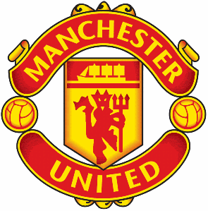
In honor of my new renter for this week, Manchester United Era (a solid source of information for all things Manchester United), I have declared today, Man U Day here at The Sports Logo Pundit. You may be asking yourself, "just how does The SLP celebrate Man U Day?" Very good question! Like every other day here at The SLP, we celebrate by tearing the Man U logo a new one.

Manchester United's logo blows goats big ti...No, no, no, wait a minute. Man U's logo kicks ass! I mean, the devil is featured quite prominently, although his giddiness kind of puts me off a little bit - that is one happy Satan. There is a ship (maybe a schooner?) dropped into the logo, and in case you didn't know which sport Man U played, there are a couple of soccer balls thrown in for good measure.

This logo pretty much has it all. The devil rocks, the ship is sweet, The colors are bold and interesting, the feel of the logo is very state-of-the-art, but it still retains a classic coat-of-arms look. It's simple, it's understated, and yet it conveys so much and is recognizable throughout the world. It might be as close to a perfect logo as you can get.

Now, I will admit, I am totally and completely ignorant regarding the history of the Man U logo, what the devil and the ship signify, or why the Dark Lord is so cheery. So I call upon our friend over at Manchester United Era to ask if he can give us a little bit of background into this incredible logo.

I think it's the least he can do for ruining the Man U Day celebration I had planned.

Labels: , ,


Sunday, March 26, 2006

St. John's Fog Devils


Tonight I found one of my favorite new logos and bar none, my favorite hockey mascot.

St. John's, Newfoundland was awarded an expansion franchise by the QMJHL (or LHJMQ for all of you French Canadians)in 2004. After months of contentious negotiations the team finally signed a lease to play at Mile One Stadium for the 2005-2006 season and promptly held a name-the-team contest. The winning entry: The Saint John's Fog Devils. The logo: The dark lord himself. God bless Canada.

If the Fog Devils played in the United States, there is absolutely no way this logo is ever used. The powers that be running the team would never green light a logo with an image of Satan as the primary feature. Play it safe. Shoot for the middle. A sense of humor is overrated. Fierce but cute and non-threatening, that's what they want.

And if they did green light it, the uproar from the churches would make them change their minds in five minutes. It would be an outrage, a slap in the face, a mockery of the church. A false sense of persecution and righteousness would drown out everything else and the owners would have to retreat to something safe like the Dynamo (I know I whined about the 1836. I'm being a bit hypocritical, but they did cave those big weenies).


But this is Canada and they have much more to worry about than the fact that the local hockey team has a devil as their mascot, like not freezing their little toes off. It's a much more laid back and relaxed atmosphere up there, not everything is taken as an affront and an insult. They have a good sense of humor and are able to laugh at themselves. A Newfoundland winter would be very difficult to get through without being able to do so.

So thank you to the owners of the Saint John's Fog Devils for green lighting this wickedly awesome and fun logo and for bringing Scorch into the lives of hockey fans across Newfoundland. I'll be rooting for you to take out the Cape Breton Screaming Eagles and their dull, clipart logo. Go Devils!

Labels: , ,


Tuesday, July 19, 2005

Wenatchee AppleSox

One of my favorite trends in baseball right now is the emergence of the collegiate summer baseball leagues in small town all around the country. These teams have always been around but were usually run solely as a baseball team and nothing more in front of a handful of family members. But lately they have started to run these teams just like minor league teams providing quality family entertainment without the prohibitive costs that would make a minor league team or independent team in a city like Wenatchee fail.

The Wenatchee AppleSox are one of the biggest success stories to come out of this trend. Wenatchee is a town that isn't nearly big enough to host even independent baseball but it has a ballpark and is desperately in need entertainment. But the local owners of the AppleSox recognized an opportunity a few years ago and stepped it up. They did a little bit of work to the 1,200 seat Paul Thomas Sr. Stadium at Wenatchee Valley College and started promoting the team like crazy. Now they average right around 1,000 fans a game and put on a great show every night. I went to a game three years ago and I rank it in the top ten of my favorite baseball experiences. I regret not getting a chance to go back before I moved to California.

But what about that name and logo? It's a very awkward name, I will admit that. But it does grab your attention immediately and is not easily forgotten, exactly what a team in Wenatchee needs. Plus it incorporates the one thing that Wenatchee is famous for, apples, and I couldn't imagine a team not recognizing their importance to the city. The logo is very clean, simple and classy and much more professional looking than a lot of other collegiate teams. It is the perfect name and logo for a classy team breaking new ground and succeeding in a little burg like Wenatchee.

Labels: , ,


Sunday, July 17, 2005

San Angelo Saints

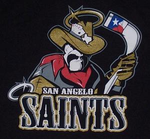
I was saddened today to read the news that the San Angelo Saints of the Central Hockey League had suspended operations. I'm not sure how I missed it, but they closed up shop in April right in the middle of the season meaning that I'm only three months behind the times. I'm so far behind that I couldn't find a big version of their secondary logo (above) anywhere on-line so I had to take a picture of my t-shirt. Sadly this means that one of my all-time favorite logos is going extinct.

Last week I talked about how much I love simplicity. Well, the Saints logos are the exact opposite of simple. In fact, they may be the most complicated logos ever to grace the front of a hockey jersey and that's why I love them.

First lets look at the secondary logo at the top of this post. The first thing you notice is how incredibly detailed his face and body is. He looks like a Texas cowboy through and through. He's got the mustache, the big chin, the leathery face, the bandana and the hat. If you just left it at that, it would work as a logo by itself. But they added all sorts of little details to spice him up. The Texas flag on the hockey stick, the aces and eights in his hat. The shape of Texas on his hat, the lonestar halo. They say that everything is bigger in Texas. Well this logo is supersized and they fit everything you could possibly think of into it.

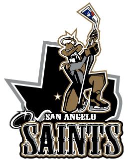
Now the primary logo (above) isn't as detailed and until today I didn't really care for it as much as the secondary logo. It still has a lot going on in it, the lonestar halo, the flag on the stick and San Angelo marked on the map behind him, but I never understood what he was kneeling for. But I read an old article at SSUR.org that explained what he is doing and it is one of the best explanations ever.

“It’s based off St. Michael," (Saints GM Daniel) Chaput explained. “Most pictures of him, he’s seen with a sword stabbing the devil. We have a West Texas version of that."

Wow! Have you ever heard of a sports franchise that can explain their logo in such terms. So he's stabbing the devil with his hockey stick. That explains everything. Awesome!

I now think that the San Angelo Saints primary logo is one of the most intelligent and brilliant logos in the history of sports. I saw the secondary logo a few years ago and immediately ordered a t-shirt blown away by the detail. Had I known the little tidbit about St. Michael and their primary logo I would have purchased one of those t-shirts as well.

Alas, the Saints are no more. They were not blessed with good attendance despite the brilliance of these two logos and I was too late to find out about their passing to take advantage of a closeout sale.

Labels: , ,