
Houston Aeros
First of all, go check out my renter for the week, Deep Fried Fish Blog, a pretty good blog all about the Florida Marlins.
I have been pretty harsh to the City of Houston since The Sports Logo Pundit returned a few months ago. First it was the Houston 1836 then the Houston Dynamo and reports of just how squalid that city is.
But for once I have nothing bad to say about the City of Houston other than it is an awful, terribly disgusting, ridiculous city full of idiots. Instead I have positive news. The Houston Aero's have a new logo, and I like it.
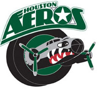
Well, it isn't such a new logo, they just jettisoned their latest logo (no pun intended) in favor of their previous logo. And actually they haven't completely jettisoned the fighter jet (shown below), it is just going to be their alternate logo. Confusing, isn't it?
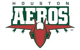
Most hockey logos, in my opinion, are best when they are rounded rather than angular. The fighter jet logo is too pointy, not to mention the extremely boring font that they used in the logo overpowering script.
The "Bomber" logo (the new, old one) is nice and rounded, almost to a fault (how are the wings going to fit through the puck? Oh the horror!). Plus the font is very creative and different, and I absolutely love the look of WWII B-52 B-17 bombers.
Either way the Aeros can't lose. Marketing to the conservative, patriotic base is a shrewd move in Houston. An American military logo, no matter what it looks like, can't go wrong.
posted by Brandon @ 10:08 PM
![]()
![]()


4 Comments:
That's no B-52, that's a B-17 in the logo. Regardless, it's nice to see a classic come back.
I knew B-52 wasn't right, thanks for the correction
What did Houston do to you?
It's my home town, but I don't live there NO MO!
I've totally wanted a Houston aeros jersey for years. I love the whole design. The new one sucks.
Post a Comment
<< Home