Wednesday, August 29, 2007

Houston Leones

Ok, I'm going to give you fair warning before I show you this logo. It is one of the most disturbing and nightmarish logos that I've ever seen.

Earlier this month the United Soccer League announced the arrival of the Houston Leones (thanks to SLP advanced scout Jesse Acevedo for alerting me). The team will play it's home games at owner Juan Carlos Hernandez's Soccer World Center in Richmond, Texas. Because they will be totally in control of their own stadium and because of Hernandez's close ties to the local Hispanic community, the USL and the Leones expect to be very successful, and I'd be willing to bet that they will do quite well for themselves.

You know, I think I need to become a successful developer with the resources to just build my own stadium. I can't find a link, but apparently this Soccer World Center is a 17 -acre facility that has three fields including the main stadium that seats 4,500 fans and is able to expand to a 8,000 - 10,000 capacity. I should have something like that for baseball. All it would take is the business know how and years and years and yeas of hard work.

So maybe I won't be building my own facility, because I know nothing about real estate or construction. But if Juan Carlos Hernandez would be willing, I'd gladly accept a gift of a baseball stadium from him. Please Mr. Hernandez?

Ok, enough talk, it was just an excuse to make sure that the hideousness of their logo is below the fold. I'm sure this team will be successful, but this logo isn't going to do them an favors. It's bad...scary bad. It's haunted my dreams since Jesse first emailed it to me. Consider yourself warned, I cannot be responsible for what happens here on out...


Sleep tight! Don't let the Narasimha TEAR YOUR FRIGGING HEAD OFF!


Team: Houston Leones
League: USL Premier Development League
Location: Richmond, Texas
Stadium: Soccer World Center

Labels: ,


Monday, July 09, 2007

Rio Grande Valley Vipers


On the other end of the D-League spectrum from the Iowa Energy is the Rio Grande Valley Vipers. Thanks again to Mike for emailing me this logo.

The name Vipers isn't unique, in fact, it's pretty overused. Just off the top of my head I can name the Calgary Vipers of the Northern League and the Tennessee Valley Vipers of af2, and I know there are more. But at least it makes some sense. Snakes are quite common in the RGV and the team calls Dodge Arena home and Dodge produces the popular Viper sports car. It's not a great reason to choose a nickname, but at least there's an OK reason, albeit unofficial.

But where the name leaves something to be desired, the logo more than makes up for it. I have to applaud the Vipers management for going with something so clean, compact and simple. The Vipers nickname invites people to go crazy design-wise, whether it be the cartoon in Calgary or the unnecessary craziness of Tennesee Valley. But the RGV Viper is very life-like and comes off as a lot more intimidating. And instead of holding onto the necessary sport identifier that we see in all of these logos, it is naturally slithering around it.

I also am a fan of this logo because there's no outline of the state of Texas anywhere, and I like to pretend that the basketball is the same snarling basketball in the Energy logo and it's about to be put out of it's misery by a far superior logo.

Team: Rio Grande Valley Vipers
League: D-League or NBDL - I can't remember what they want to be called now.
Location: Hidalgo, Texas - the greater McAllen metroplex
Arena: Dodge Arena

Labels: ,


Thursday, May 31, 2007

Ignorance: The Key to Player Procurement

I just finished reading a really interesting article in Baseball America's Independent Preview section about the struggles that independent managers have when putting together a team (sadly, it's a subscriber only article). It got me to thinking about my own baseball career and how much responsibility I had on my first full-time baseball job despite having absolutely no idea what I was doing.

In 2001 I worked for the Rio Grande Valley WhiteWings as the Director of Public/Media Relations. It was my first full-time position in baseball and turned out to be the last full season that I spent with a team. It was one hell of a horrible season. Attendance lagged, our team stunk going 40-56 under the "leadership" of George "The Boomer" Scott and Harlingen, Texas wasn't really my idea of a great place to live. Nonetheless, I was doing what I loved and tried to make the most out of it.

Sometime early in the season, Boomer walked into the front office, and bellowed "hey big man! You got any players for me?" For a couple days I had no idea what he was talking about. Our general manager handled all of the player procurement duties, why would he ask me? I had no contacts, I didn't know anybody in baseball and I didn't have the foggiest idea where to start.

So I went to the Minor League Baseball website and started scouring the transactions page looking for any left-hander that was released from High-A or above. I compiled a short list of guys that I thought might have a chance at playing in our league, but again, I had no idea what to do next. How do I ever get a hold of these guys? It's not like their or their agent's phone numbers were published anywhere and I didn't expect that MLB teams would be willing to share information with a random PR guy in a low-level independent league.

It turned out I was wrong. I grabbed the BA Baseball Directory and started calling Major League team's minor league or scouting departments asking anybody I could if they had contact information for any of these guys. I had no idea if this was proper etiquette or if I would get laughed off of the phone, but it was worth a shot. Surprisingly, given the chilly relationships between MiLB and the independents, I found most every organization to be very accommodating. I even managed to get the Reds to give me Deion Sander's information (including personal cell number) after he was released.

Then, once I had their information, I started calling the players to find out their story and see if they had any interest in playing for us. This is where it usually got interesting. I called one guy who had been released from Double-A despite being a high draft pick with really impressive numbers. His father answered the phone and after explaining who I was and asking if his son was available or interested in playing independent ball, he very shortly explained to me that his son was released because he was undergoing treatment for manic depression and that he probably was finished playing baseball. I felt horrible because the tone of his voice was very sad and he was a little bit angry (he had asked the organization not to release his son's information).

Calling these guys was both horrifying and rewarding, sometimes at the same time. I could always tell that these guys were depressed that they had been released. I would be too if I was fired and had to face the fact that my dream career might be over at 25. Once I explained myself, some guys sounded insulted at the prospect of playing indy ball while others were excited to get a call from anybody. Others had already moved on lining up jobs or going back to school.

For example, I called a pitcher that I knew who had just been released from the Elmira Pioneers and he answered while on his way to his first law school class. I told to him to forget that I ever called, we wouldn't sign him even if he wanted to come play for us. I wasn't about to have a guy delay his law career for a team that was already 10 games under .500.

Once I made contact and figured out if they were interested, I passed them along to Boomer and our GM for the final decision. We signed a couple of these guys, some turned out to be good and some were bad.

After figuring out that I could get away with this method (which to this day I don't know if it was truly kosher or not)I had it down so that by the time Boomer walked into the office each day, I had a packet of information on every player released the previous day. So when he yelled "hey big man! I need a first baseman...find one!" I had one handy and ready to go.

Anyway, it was fascinating and kind of gratifying to read that independent managers with a lot more contacts and experience basically do the exact same thing that I used to do and struggle with it in the same way that I did.

Labels: ,


Monday, February 19, 2007

San Antonio Steers


Bad news from the fantasy land that is the National Indoor Football League's league office: The San Antonio Player Haters are no more.

The single greatest nickname and logo in the history of indoor football has sadly been replaced by the San Antonio Castrated Cows. I'm sorry, I mean the San Antonio Steers - although the San Antonio Castrated Cows does have a nice ring to it and means the same exact thing (thanks for the tip John!).

The Steers logo just doesn't have the same appeal as the old Player Haters logo did despite their attempts to confuse us with the current green logo that is now featured on the NIFL website (above), an earlier identical logo but in blue, and a totally different blue logo currently featured on the team's website. All of this unprofessional confusion is good, but it still doesn't take away the sting of losing that beautiful horse logo.

The good news is that not all is lost, It appears that the testicle challenged bovines will still be calling the San Antanio Rose Palace Eq. Center in San Antonio home. I thought that maybe when they ditched that player hating horse, they would move from their Equestrian Center home field into a county fair barn. But the league is still selling tickets to games at the Equestrian Center against teams like the Fort Worth Sixers, Beaumont Drillers and a mythical Pasadena team and it appears that they have retained the Player Haters logo for the home turf.

And the good news continues, the NIFL is still selling the sweet Player Hater fuschia jerseys for the low, low price of $79.00. Get yours soon because these promise to be one of the most sought after collectibles of all time.

Team: San Antonio Steers
League: National Indoor Football Leauge
Location: San Antonio, Texas
Arena: San Antanio Rose Palace Eq. Center
Online Store: Player Haters Jersey!!!!

Labels: ,


Friday, February 02, 2007

Brazos Valley Bombers

Oh Texas, why do you force yourself into the background of almost every single one of your state's sports team logos (that isn't true, I just review all the ones that do)? It's too bad, because quite often, the logos themselves are just fine.

The Brazos Valley Bombers logo is a great example of this. I like the script, I like the bomber and I really like the baseball bombs, but the outline of Texas in the background doesn't work for me.

Maybe it's because I don't like the way that they made the outline fit around the script instead of just letting it overlap. Or maybe it's because I think that it is unnecessary for a team that plays in a league composed totally of other teams from Texas to use the state's outline as a geographic signifier. Or maybe it's because I spent the worst summer of my life in Texas and I have a very negative reaction to that state in general.

No matter what the reason is, and it's probably a whole bunch of all the above, the State of Texas needs to stop making me dislike otherwise decent logos. Or at least be willing to go over the top with it like my favorite Texas logo and one of my favorite logos of all time, the San Angelo Saints. Now that's the way to use the State of Texas in a logo.

Team: Brazos Valley Bombers
League: Texas Collegiate Baseball League
Location: Bryan, Texas
Stadium: Travis Field
Cheerleaders: The Bombshells (I think they are supposed to be cheerleaders)
Mascot: Kaboom
Online Store: The Bombshelter - T-shirts with Texas, hats without.

Labels: ,


Tuesday, January 09, 2007

Texas Tornado

Does a junior hockey league team lose something when it's owned and operated by a big, important sports marketing firm that comes complete with their own Pyramid? Perhaps it does lose some of it's independent spirit. But what it loses in hometown pride it makes up in shiny, well developed logos!

The Texas Tornado are owned by Schlegel Sports, who also owns the Iowa Stars of the AHL and the Triple-A Tacoma Rainiers baseball team. They play their home games at the same facility that houses the Dallas Stars practice arena and have close ties to Hicks Sports. The Tornado are well financed, well connected and have been uber-successful since their inception in 1999.

The logo is simple, especially for a Texas based team, and does an excellent job of working in the Stars theme without being called the Junior Stars. The color scheme is unique in that it features only two colors other than white, which again is a major coup for a Texas team especially since those two colors aren't red and white.

My only complaint is that they are the Tornado and not the Tornadoes. It's a totally different connotation without the "es". Although after typing Tornadoes, I can see why.

Team: Texas Tornado
League: NAHL - National Champions 2001, 2004, 2005 and 2006
Location: Frisco, Texas
Arena: Dr. Pepper StarCenter
Online Store: Decent logo, ugly jerseys for sale.

Labels: ,


Thursday, December 14, 2006

San Antonio Player Haters


Suddenly, I hate the request-a-review feature of The Sports Logo Pundit. A big thanks (sarcasm is so hard to type) goes out to Big Daddy Mc "G" for requesting the San Antonio Player Haters of the National Indoor Football League. I chose to ignore the NIFL's new logos since they magically appeared on their website a couple of weeks ago, I didn't want to give them any promotion since I don't think that they are indeed legit logos. But since Jim asked, he shall receive.

Actually, what can I possibly say? We all know that this is awful. What blows my mind is that the NIFL has gone with it and posted it on their website. Are they trying to sabotage their own league? Do they not want anybody to take them seriously? I know that minor league football is unstable and typically unprofessional, but this is ridiculous. What a joke.

But just in case you are a total nutjob and have become a big Player Hater fan, their logo jersey is on sale at the NIFL store for only $79.00. Wear it with pride...freak.

Labels: ,


Sunday, October 22, 2006

San Angelo Stampede Express

While searching for a random logo to review tonight I stumbled across the Intense Football League's San Angelo Stampede Express.

There isn't a whole lot to say about their logo. It's a mish-mash of their old logo and a train, made possible because they had to change their name before the 2006 season. Rather than come up with something new, they just stuck an "Express" after "Stampede" and called it good. Whatever. It's minor league football, what are you going to do?

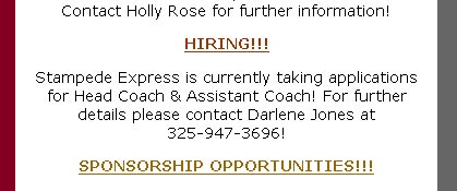
But what really caught my attention was this listing on the front page of their website...


I know this is a homegrown, small town, family run team, but I had no idea that it was as simple as filling out an application to become a coach in the IFL. Whatever happened to "send your resume to..."? Perhaps this is a good idea, this leaves no opportunity for a coach to pad their resume with fake jobs and with the practice they just had filling out the McDonald's application last week, this should be a snap.

Labels: ,


Tuesday, May 16, 2006

Laredo Broncos


The United Baseball League opened their inaugural season tonight with three games including Central Baseball League holdovers San Angelo hosting the brand new Laredo Broncos and the Rio Grande Valley WhiteWings returning to Harlingen to face the hated Edinburg Coyotes, the replacement for the team that essentially forced the WhiteWings to close up shop a few years ago.

I'm very interested in this league because of my ties to Harlingen and the Rio Grande Valley WhiteWings. I really want to see this league succeed if only to prove that these markets can be successful under the right leadership and if they are given the proper resources, something that we desperately lacked when I was working down there. The key is relating to the Mexican population. Harlingen is probably 80% Hispanic and yet we didn't capitalize on that number at all. Show the Mexicans some love and I would bet they would come out.

But that's another topic for another day. Let's forget about it for just one second so I can properly critique a logo.

Two of the league's logos are new for the 2006 season, while the others are using old logos from teams past. Of the new logos, I have already reviewed the Edinburg Coyotes, a jumbled, incoherent mess of a logo. As for the Broncos, The ULB did a little bit better job, it isn't awful. But there is definitely something wrong with it and ultimately I don't particularly care for their inaugural logo.

The color scheme is nice and the sun in the background is a good little touch. But the font on BRONCOS is extremely dull and looks forcibly squeezed together. The Bronco itself has nice detail but looks like it is doing a handstand rather than bucking. It lacks any kind of action.

Also, though not to be crude (gee that wouldn't be in my nature, would it?), am I the only one that thinks the tail doesn't look like a tail? When I first took a look at this logo as a thumbnail on Our Sports Central, I did a double take. My first thought was that there is some kind of noxious gas rising from the backside of the Bronco. Obviously, once I really looked at the logo, I found that I was wrong. But still, the tail doesn't look right and it makes the logo look lopsided and out of whack.

All of this doesn't mean that I won't be rooting for the Broncos. Laredo is a huge, growing city that has whole heartedly supported minor league hockey and typically supported Los Tecolates before they left Dos Laredos. It would be nice to see baseball finally survive and thrive down on the border.

Labels: ,


Tuesday, April 18, 2006

Houston Aeros


First of all, go check out my renter for the week, Deep Fried Fish Blog, a pretty good blog all about the Florida Marlins.

I have been pretty harsh to the City of Houston since The Sports Logo Pundit returned a few months ago. First it was the Houston 1836 then the Houston Dynamo and reports of just how squalid that city is.

But for once I have nothing bad to say about the City of Houston other than it is an awful, terribly disgusting, ridiculous city full of idiots. Instead I have positive news. The Houston Aero's have a new logo, and I like it.

Well, it isn't such a new logo, they just jettisoned their latest logo (no pun intended) in favor of their previous logo. And actually they haven't completely jettisoned the fighter jet (shown below), it is just going to be their alternate logo. Confusing, isn't it?


Most hockey logos, in my opinion, are best when they are rounded rather than angular. The fighter jet logo is too pointy, not to mention the extremely boring font that they used in the logo overpowering script.

The "Bomber" logo (the new, old one) is nice and rounded, almost to a fault (how are the wings going to fit through the puck? Oh the horror!). Plus the font is very creative and different, and I absolutely love the look of WWII B-52 B-17 bombers.

Either way the Aeros can't lose. Marketing to the conservative, patriotic base is a shrewd move in Houston. An American military logo, no matter what it looks like, can't go wrong.

Labels: ,


Tuesday, March 07, 2006

Houston Dynamo


I just want to thank the ownership of Houston's new MLS team for coming to their senses. The Houston 1836 was perhaps one of the stupidest names in all of sports. Not only because it sounded dumb, but because the name alone offended a huge portion of the team's future fans. Thankfully, the team was officially renamed the Houston Dynamo yesterday. It may be boring, but at least it isn't offensive.

Hey, the Sports Logo Pundit has jumped on the Rent My Blog bandwagon. Go check out my renter Haunted House Dressing. He truly has one of the most unique and odd blogs going today.

Labels: ,


Sunday, March 05, 2006

Edinburg Coyotes


The Central Baseball League is no more. Half of the teams joined the Northern League defectors to form the new American Association while the other half joined the upstart United Baseball League. But one team got left behind and got kicked out of their baseball stadium in favor of a new team.

The Edinburg Roadrunners, after years of success at the box office but idiotic management that eventually led to their demise, were given the boot earlier this year. Enter the Edinburg Coyotes, possibly the United Baseball League's best shot at success. Unfortunately the chose a name with two strikes against it from the outset.

First of all, the old team was called the Roadrunners, the new team is called the Coyotes. Have you figured out the connection yet? It is so lame you wouldn't believe it. The Coyotes refer to Wile E. Coyote who, of course, chases after the Roadrunner. That might be a little funny if it weren't for the fact that the Roadrunner always gets the better of the Coyote. That is a bad start. Strike one.

Secondly, a coyote is a term used down in the Rio Grande Valley (and all along the border) for someone who illegally smuggles Mexican immigrants into the USA. Coyotes aren't very well liked. The Mexicans don't like them because they typically treat the immigrants like crap while in transport and the white folks don't like them because they bring the Mexicans into to town illegally. Strike two.

Now, if the logo at the beginning of this post is their logo, we've got strike three. (I haven't been able to find an official logo for the Coyotes yet - they have no website, the local newspapers were of no help, and the UBL website is still under construction. The logo is from this design site) This logo, like all logos from the State of Texas, has way too much going on. A coyote howling, a baseball moon, a baseball moon shadow, the state of Texas with Edinburg marked with a star, a big blocky coyotes script, Edinburg in a box and a baseball diamond in the background. Seriously, what else could they possibly squeeze in there?


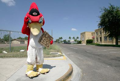
I can't believe I am going to say this because I used to work for the Rio Grande Valley WhiteWings and the Edinburg Roadrunners were our arch-rivals on and off the field, but I already miss Rowdy and the Roadrunners. Despite better and more likeable management (they couldn't get much worse than the Roadrunner's management) the Coyotes are a really poor substitute and they have already struck out with me. (Homeless Rowdy photo found here with other really cool photographs)

Labels: ,


Wednesday, February 01, 2006

Houston 1836


The San Jose Earthquakes are gone. Please welcome to Major League Soccer the Houston 1836 joining D.C. United, FC Dallas and Real Salt Lake in a retarded attempt to sound European. Congratulations Houston 1836, you are the most European of them all, in more ways that one.

the 1836 chose their name to honor the founding of the city of Houston, otherwise known as the worst year in this nation's history to anybody who has ever visited that cesspool of a city in the middle of summer. Or for that matter, in the middle of winter, spring or fall. I hate Houston with a passion.

It also is a horrible date for a group of people who are expected to comprise a large part of the 1836 fan base, Mexicans. The secession of Texas and the founding of Houston all came at the expense of Mexicans, and it sounds like they haven't really forgotten it. Add the image of Sam Houston leading the charge against the Mexican army to the logo and you can understand why there might not be too many Latinos proudly displaying their love for their new football team.

So in conclusion...

Fake European MLS names = Retarded
Houston 1836 = Retarded and ignorant
The City of Houston = Retarded, ignorant and squalid
Goode Company BBQ = Only redeeming quality

Labels: ,


Sunday, July 17, 2005

San Angelo Saints

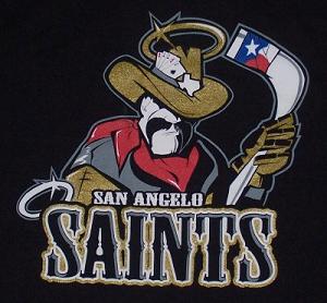
I was saddened today to read the news that the San Angelo Saints of the Central Hockey League had suspended operations. I'm not sure how I missed it, but they closed up shop in April right in the middle of the season meaning that I'm only three months behind the times. I'm so far behind that I couldn't find a big version of their secondary logo (above) anywhere on-line so I had to take a picture of my t-shirt. Sadly this means that one of my all-time favorite logos is going extinct.

Last week I talked about how much I love simplicity. Well, the Saints logos are the exact opposite of simple. In fact, they may be the most complicated logos ever to grace the front of a hockey jersey and that's why I love them.

First lets look at the secondary logo at the top of this post. The first thing you notice is how incredibly detailed his face and body is. He looks like a Texas cowboy through and through. He's got the mustache, the big chin, the leathery face, the bandana and the hat. If you just left it at that, it would work as a logo by itself. But they added all sorts of little details to spice him up. The Texas flag on the hockey stick, the aces and eights in his hat. The shape of Texas on his hat, the lonestar halo. They say that everything is bigger in Texas. Well this logo is supersized and they fit everything you could possibly think of into it.

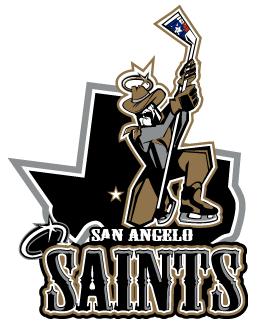
Now the primary logo (above) isn't as detailed and until today I didn't really care for it as much as the secondary logo. It still has a lot going on in it, the lonestar halo, the flag on the stick and San Angelo marked on the map behind him, but I never understood what he was kneeling for. But I read an old article at SSUR.org that explained what he is doing and it is one of the best explanations ever.

“It’s based off St. Michael," (Saints GM Daniel) Chaput explained. “Most pictures of him, he’s seen with a sword stabbing the devil. We have a West Texas version of that."

Wow! Have you ever heard of a sports franchise that can explain their logo in such terms. So he's stabbing the devil with his hockey stick. That explains everything. Awesome!

I now think that the San Angelo Saints primary logo is one of the most intelligent and brilliant logos in the history of sports. I saw the secondary logo a few years ago and immediately ordered a t-shirt blown away by the detail. Had I known the little tidbit about St. Michael and their primary logo I would have purchased one of those t-shirts as well.

Alas, the Saints are no more. They were not blessed with good attendance despite the brilliance of these two logos and I was too late to find out about their passing to take advantage of a closeout sale.

Labels: , ,