
Milwaukee Admirals

Could this really be the most hated logo in all of America right now? No, but it does seem to be running a close second only to the disaster that is the new Buffalo Sabres logo (a hot topic for another day).
The Milwaukee Admirals wanted to make a big splash with their new logo, really shake things up for this minor league team in a major league city. And that they did, creating a logo that immediately elicited the ire (or iiiiiiire - sorry) of the local hardcore hockey community, the logo nerds on the Sports Logo Forums and even Uni Watch.
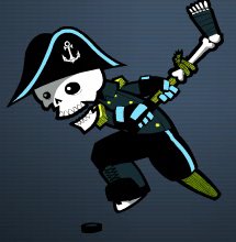 But has it drawn the ire (iiiiiirrrre) of The Sports Logo Pundit? Hell no, this logo is awesome! It's one of my absolute favorites that I have reviewed. But I love pirates, I love cartoons and I love the severed leg hockey stick.
I know that I'm not very consistent about what I like and don't like. I've ripped a lot of logos with the same cartoonish quality, but something about this one just works for me. It's cool and fun and I think it will be ridiculously popular in the long run, especially with the kids.
Sometimes as a minor league operator you have to make tough choices and the Milwaukee Admirals made one. I'm sure that they knew that the hardcore, traditional hockey fans were going to react negatively to the logo at first. But I'm also sure that they did their homework and know that it will be hugely popular with casual hockey fans that are going to bring their friends, spouses and kids to games. If the kids have a good time, and the pirate theme will help immensely with that, you can bet that the entire group will be back. This is how you create new, hardcore hockey fans.
The current traditional, hardcore hockey fans won't really drive to Madison or Chicago for their hockey, regardless of what they say now. Once the season rolls around there won't be any boycotts. They will probably be the first in line for jerseys (especially if they have kids). The amount of fans that the Admirals will lose because of this logo is negligible. The amount of fans that they could win with it is much higher.
Besides, if you look close at the jersey, check out the bone anchors. Very cool! I can't wait to get a t-shirt, maybe even a jersey? It's August 5th, isn't it time you started your Christmas shopping?
posted by Brandon @ 11:22 PM
![]()
![]()


14 Comments:
Totally SWEET! A little complicated as far as logos go... but a skeleton pirate?? Dude!
I am so there.
Just went to buy one... IT'S A BUCCANEER JERSEY WITH LACE-UP FRONT TOO!! Awwww... it's a seven-week wait before the jersey arrives. Oh well, at least it won't be as hot then. Thanks for the link!
I couldn't agree with you more. Not since the Houston Aeros came out with their WWII flying ace jersey have I seen a cool hockey shirt.
Thanks for introducing me to the team! I love the jersey, and being a slight connoisseur of hockey jerseys, I think I am going to get myself one. I love the blog as always
At first I hated this new Admirals logo... but then I never really cared for the old one. But the more I see it, the more this new one grows on me. I love collecting odd ball hockey jerseys, and this one would make a graet addition to my collection!
Great Blog by the way!
PS. My favorite logo of all time is/was the Price George Spruce Kings. Check it out on the Spruce Kings page of my site: http://members.shaw.ca/margroxx/BCHLsprucekings.html
I LOVE IT!!! Pirates and skulls rank up there in the "things I love" list, right next to my wife. I can understand why some people might not like it, it is a little cheesy. But just enough cheese makes a great sandwich. Once they take a bite, they'll be coming back for more. My favourite part is the anchors...very nice.
Ronn roxx,
The Prince George Spruce Kings logo is cool too. It's like there's an angry tree who's gonna chop down the competition. lol
I like it.
I know this is WAY late, but here lies the problem with the new logo. The team's name is ADMIRALS, not pirates! Everyone links the new logo to pirates and it's not supposed to. I don't like the logo. I still have my season tickets because I am a huge fan of our coach, Claude Noel, and I will support him no matter where he is. I have not bought a jersey or T-shirt and I won't...not with the skull logo anyway. I'm still pondering the bone anchor shirts, however. I'm just trying not to encourage the office. Right now we've got bigger problems.
Mine just came and i love it. I got the dark, it's amazing.
where are you boners getting the pirate from? its a skeleton in an admirals uniform (pirates dont give each other commendations and medals).
i dont see a jolly roger anywhere... you people and your fabrications...
if you dont like this logo, you're anhedonic
Ok, ok...you're right, it's not a pirate. I just said pirate because that's what I equate skulls and crossbones like that to.
It's an admiral of the damned. Still pretty frigging cool if you ask me.
I went to an Admrials game last night in San Antonio and we SUNK !
But anyway, I noticed that on the right breast of the jersey was the OLD TIMEY Milwaukee Brewers patch. What's up with that ?
I really don't care for this logo, it looks like it was thrown together
This logo sucks!!!!!
Haven't been to a game since and I used to have season tickets.
Why? Because it's the lamest logo change in the history of professional sports!!!!
The Admirals got rid of tradition and sold out...
this logo and team sucks how can you like them
Don't like it at all. Looks like something from Nickelodeon. They could have come up with something way better.
Post a Comment
<< Home