
Marquette Rangers
Michigan's Upper Peninsula has a new hockey team. The Marquette Rangers will join the Junior-A North American Hockey League for the 2006-2007 season playing in the city's Lakeview Arena. Marquette is a hockey town through and through with incredible high school hockey, the Northern Michigan University Wildcats and now the Rangers.
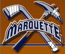
It is also a big mining town and the Rangers have done a great job of capturing that part of the area's culture in their logos. Both logos show exactly what Marquette is all about, mining and hockey. The first logo is great, simply because I love the crossed hockey stick and pick. The crossed sticks goes a long way with me in any logo.
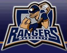
But of course a team has to have a mascot so along comes this dude. Unfortunately they picked the most generic looking guy, you could easily trade out the hat and create any number of different logos. And I have said it before, but I will say it again - why can't we get some eyes on these mascot logos? What is it about the eyes that are so difficult? Are they so hard to draw that design companies charge more for them?
But what caught my eye about the Rangers is their ubiquitous use of slogans. On the front page of their website are two outstanding slogans...
"Life is short, do what makes you happy, watch Rangers hockey"
"Hockey with American ingenuity, Canadian grit and European flare"
But may I suggest a slogan that might work a little bit better...
"The Wildcats aren't playing and its ten below outside. What the hell else are you going to do in Marquette,Michigann?"
That would get me into the arena any day, because it's true.
posted by Brandon @ 11:04 PM
![]()
![]()


1 Comments:
The boys perfectly play.
Post a Comment
<< Home