Monday, November 05, 2007

From the SLP Archive: Jamestown Jammers

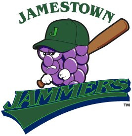
I'm still not 100% back to the Sports Logo Punditry, so let's dig back into the archives really quick. I was just reading my new issue of Baseball America and I saw the Jamestown Jammers logo a couple of different times. I still can't believe that this is an actual logo used by an actual, professional Minor League Baseball team. It makes me shudder every time I see it. Originally posted on April 9th, 2006...


I don't know how this new logo for the Jamestown Jammers of the New York-Penn League slipped under my radar for so long, but now I long for those carefree days of sweet, ignorant bliss.

The Jammers had a pretty awful logo to begin with, but you would expect that with change would come improvement. Sadly, that is not the case. I thought that minor league baseball had progressed past these cheap looking designs. There have been some bad, cartoony logos introduced over the past few years, but at least they look professionally done.

This is, without a doubt in my mind, the worst logo in baseball and it rivals the Charlotte Krunk for the worst logo reviewed on the SLP. Please, let us put this logo behind us and move forward to bigger and better things. I encourage the Jammers to do the same thing.

Labels: ,


Sunday, September 30, 2007

Binghamton Mets

Our latest correspondent random review comes from Nick, who briefly wrote a rival logo review site, Logo Quality Control, before I crushed it like a bug. Just kidding, I really enjoyed his site's short run before it succumbed to the "blocked at work" fate that kills so many blogs. If only our employers were more sympathetic to our nerdiness.

A few years ago, my wife and I took a short road trip through Pennsylvania and New York and we ended up spending the night in Binghamton. There was some sort of motorcycle or RV or boat fair going on, I can never keep them straight, and as a result, every hotel was booked solid. Keep in mind, we’d been driving straight from Virginia, we’d witnessed a terrible car accident, and we drove through a town that had been long ago abandoned because of underground coal fires. We were tired and we were ready to get some dinner and get to sleep.

Eventually, we did find something—a Super 8, I think—on the edge of town. We drove downtown to find some dinner and that’s when I discovered two things I’d never noticed before. The first is something I’m sure many people never knew—the good people of Binghamton spelled their city name wrong. This happens a lot—illegible land claims, stupid postal clerks, bureaucracy at its finest. You spell a city name wrong when you send your information to the Postmaster General and you never recover.

The other, of course, is that the Binghamton Mets, the Double-A affiliate of the New York Mets and member of the Eastern League, have a “bee” as their mascot. I may have known this prior to my visit, but it struck me as odd. I don’t know even know what a Met is—I hear in the New York City area, it’s a baseball-headed creature—but I’m pretty sure it’s not a bee. I don’t think the New York Mets are one of those clubs who put firm pressure on their farm clubs to adopt the parent club’s team name, but if you like the bee theme, go with Binghamton Bees. It actually works, you know. It sounds better than Binghamton Mets anyway.

The logo itself, though… first of all, when I look at a team logo, I’m almost always looking for the bad. The bad things tend to stand out, you know? It’s like this: when you hear a terrible song, you can right away say, “Man, this song sucks.” Sometimes, though, when you hear a song you think you might like, you listen a little longer before you affirmatively state you like it. Just to make sure the chorus doesn’t ruin it or there’s no cheesy guitar solo. You have to be sure.

Well, I didn’t spend too much time looking at this logo, honestly. The colors are perfectly okay and expected with them being affiliated with the Mets and all. Blue and orange work together, generally. This logo is their hat insignia, which is why there’s no “Binghamton” or “Mets” spelled out. So that’s not a problem, either. Full team names on baseball caps never ever ever works. And I think there’s a “B” behind the bee…I can’t be totally sure because the bee blocks most of it. Which may beg the question: “Why have the ‘B’ at all?” I don’t know. Call me crazy, but if you’re going to put a letter on your hat to signify the team’s city, why obscure it?

But no big deal because it’s the entire package we’re talking about. But I can’t get behind anthropomorphic animals. I’ve tried and I’ve failed. And of all the thousands of teams that have anthropomorphized animals (or worse), it’s hard to say some aren’t as bad as others. But insects just aren’t scary when you cartoon them up and give them big arms and clothes. Especially when it doesn’t, well, look like a bee. I mean, it’s yellow. It has wings and antenna. But it looks nothing like a bee. The wings are way too simplistic. I know this is a hat insignia but this bee image appears in nearly all their team art with the same wings. They look like aspirin. Or Frisbees. And another pet peeve of mine is when a mascot in a logo wears a uniform that the team does not wear. I can find no image of a Binghamton Met wearing that uniform. And it seems a bit detailed for a logo.

But the biggest question of all is: What in the world is going on with the bee’s “tail”? Is that supposed to be its stinger? Is it a superbee? One of those African Bees from South America that was supposed to invade Texas and then the rest of America in the 1980s and kill everyone? Is that a saw? Is it some sort of swoosh to imply movement? Someone sometime needs to explain that.

It’s not awful. It’s not Tri-City Dust Devils awful. It’s family-friendly and visually attractive with its colors and its composition (even though the “B” is awkwardly obscured). It’s just that the bee itself is way too cartoony, way too detailed in some placed and lacking it in others, and I can’t for the life of me figure out why it’s a bee at all. I keep wanting to call the team the Binghamton Bees and I keep being wrong.

By the way, I’m kidding about Binghamton being misspelled. It’s just missing a “p,” that’s all.

Grade: D+


Team: Binghamton Mets
League: Eastern League
Location: Binghamton, New York
Stadium: NYSEG Stadium
Mascot: Buddy the Bee
Merchandise: Get your softee Buddy the Bee

Labels: ,


Saturday, August 04, 2007

2008 MLB All-Star Game


I love that despite being a self-proclaimed sports logos "expert", I tend to miss all of the big sports logos news until days after it's made. But to be fair to me, if a team releases a logo and it makes ESPN or CNN/Sports Illustrated or Fox Sports, I can't be blamed if I miss it. I'm too busy reading OurSportsCentral or analyzing the ABA website and it's always fluid roster of teams. Besides, I'm not really an expert, just a fan. A really lazy fan.

Anyway, somehow I've made it a tradition to review all-star game logos. I've reviewed the last two MLB All-Star logos so I guess I shouldn't stop now especially when the 2008 version is in such sharp contrast to the last two in San Francisco and Pittsburgh.

The Yankees All-Star game logo is exactly what you would expect it to be...

  • Classic to the point of being boring? Check.
  • Pinstripes? Check.
  • Facade? Check.
  • Yankees script in a prominent place? Check, although in other pictures I've seen it says "Major League Baseball" in red. That's probably the logo that all the other teams will use and this is just for the Yankees.
  • Yogi Berra trotted out like a mascot? Check.
Event: 2008 MLB All-Star Game
Location: The Bronx, New York
Stadium: Yankee Stadium
Merchandise: Yawn!

Labels: ,


Thursday, July 19, 2007

Corning Bulldogs


This was a fascinating look into how a logo is developed an illustration of what a great tool Chris Creamer's Sports Logos Community is for designers and teams alike.

The designer, cyandlux or Sean Von Felden (I assume that's his real name) started posting preliminary designs for the ABA's Corning Bulldogs logo last week. Each time he posted an updated design, the other members of the board gave him constructive criticism and with this feedback and the feedback of the owner of the team (I'm sure it was hard to please both of those inputs at the same time), in a relatively short time, it evolved into the final product shown above.

I like the logo, it's definitely one of the best logos that the ABA has ever had, but there are problems with it that even the designer admits to in his posts. Like the basketball dog tag. He didn't want that in there and neither did the other posters, but the owner really wanted a basketball in there somewhere so there you go.

He also admits that he went crazy with the outlines. One of the earlier versions of this logo was just the bulldog without wordmark or outlines or dog tag and it was the best of the bunch except for a couple of problems with the ears and nose that he ended up fixing. I think if he went with just the current bulldog without the outline, it would be an outstanding logo. But again, I think the owner wanted the outlines. What can you do?

Kudos to Sean for his solid design, which probably didn't pay too well. And also kudos to 24 year-old James Schultz, the owner of the Bulldogs for finding him, probably through the boards. I've said that if I owned a sports team and I needed a logo done on the cheap, I'd enlist the services of some of the young designers on these boards.

If history is any indication, the Bulldogs won't play out their entire season. But unlike the other ABA teams that inevitably will fold, at least the Bulldogs will have a solid logo to take to their grave.

Team: Corning Bulldogs - hopefully the find someone to redo their website as well
League: American Fraudulent Basketball Association
Location: Corning, New York - will this small town embrace this team?

Labels: ,


Tuesday, April 17, 2007

Today in Sports Logos

Today I bring you a new feature here on The Sports Logo Pundit. In an attempt to keep up with what seems like a never ending amount of sports logo news that I am notoriously slow to react to, from here on out I will do what I can to gather that news and present it semi-daily along with the normal reviews. I really would like this to be a post-a-day blog containing up to date news, but I don't always have the time or motivation to think about and then write a full review. So we are going to this new quick wrap, linky style format for the off days. Anyway, watch for Today in Sports Logos often and if you have any tips, please don't hesitate to email me.

New ABA Team of the Day - Say goodbye to the Las Vegas Venom and hello to the Las Vegas Lights. The over/under for amount of games played next season by the Lights is currently listed at three. (OurSportsCentral)

USBL Loses Two - The new USBL season is off to a rough start. First the Boston ownership group pulled out days before the season leaving the league to field the coachless New Jersey Meteors for one game against Albany. Then today the Meteors and the Long Island Primetime folded. (Jackson Clarion-Ledger)

Sonics Gone? - The Washington State legislature decided that they would not be voting on the financing package for a new arena for the Seattle Supersonics during this session. In response, Clayton Bennett popped open the bubbly, smoked a cigar and celebrated with all of the lobbyists that he kept as far away from Olympia as possible. (Seattle PI)

Corporate Ballpark Deal of the Day - The Washington Wild Things of the Frontier League announced today that five year old Falconi Field will now be known as CONSOL Energy Park. The over /under for years until CONSOL Energy is swallowed up and renamed causing the park to also rename itself currently sits at two. (Ballpark Digest)

Labels: , , , , , ,


Wednesday, September 13, 2006

New York Titans


They keep telling us that lacrosse is growing exponentially in popularity. Both the indoor game and the outdoor game are expanding rapidly trying to capitalize on the phenomenon. This expansion will test whether or not this is something sustainable or just a fad, like the Major Indoor Soccer League in the 80's.

The indoor National Lacrosse League is bringing their game to the big city expanding to both Chicago and New York for the upcoming season. The Chicago Shamrox will be playing in suburban Hoffman Estates in a the brand spanking new Sears Centre. They should see immediate success playing on the novelty of a new arena and a new team and should sustain that success until the shine wears off.

However, the New York Titans will be splitting time between Madison Square Garden and Nassau Coliseum on Long Island, hardly the way to build a fan base. The two crowds will probably be completely different. The Titans are banking that there are enough lacrosse fans in both Manhattan and Long Island to fill both arenas.

It doesn't help that the team has a head scratcher of a logo. At first I really liked it, the "T" worked in as the opening of the helmet is pretty clever and it looks very ominous. But the more I look at it, the less I identify it as a helmet, even though I know what it's supposed to be. Now that I know that the opening is a "T", it's all I can focus on. The rest of the helmet just looks like a blob surrounding the "T". And the wordmark doesn't work for me at all. The T's look like a smaller font making the "TIT" look weak. The "ANS" looks huge and it dominates the word mark.

If there is one place in this country that a lacrosse team splitting their time between two arenas could work, New York is it. But with only four games at each arena, will anybody really care about the team or will it be treated simply as a novelty. Will there be anybody screaming "GO titANS!!"?

Labels: ,


Sunday, April 09, 2006

Jamestown Jammers


I don't know how this new logo for the Jamestown Jammers of the New York-Penn League slipped under my radar for so long, but now I long for those carefree days of sweet, ignorant bliss.

The Jammers had a pretty awful logo to begin with, but you would expect that with change would come improvement. Sadly, that is not the case. I thought that minor league baseball had progressed past these cheap looking designs. There have been some bad, cartoony logos introduced over the past few years, but at least they look professionally done.

This is, without a doubt in my mind, the worst logo in baseball and it rivals the Charlotte Krunk for the worst logo reviewed on the SLP. Please, let us put this logo behind us and move forward to bigger and better things. I encourage the Jammers to do the same thing.

Labels: , ,


Tuesday, March 21, 2006

Syracuse Crunch


Welcome to everybody stopping by from Dave's Unofficial Syracuse Crunch Page. Thanks for stopping by the Sports Logo Pundit. I'm not sure if you will see this page because you are directed to one of the archive pages, but welcome to the big show anyway.

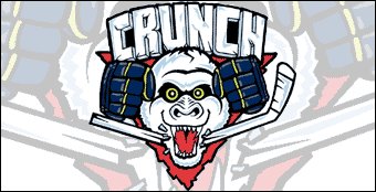
I just have one question for all of y'all. Do you like the Syracuse Crunch logo? I know that it has been their logo for quite some time, at least it has been since I spent some time in Ithaca visiting my future wife at college six or seven years ago now.

I always saw the Crunch logo and, quite honestly, thought it was unprofessional. It doesn't scream high level minor-league hockey, it reminded me more of a junior hockey logo that was done on the cheap, maybe by one of the players themselves. I think the reason that I never went to a game in Syracuse was that I thought the Crunch seemed bush league because of their logo and that it wouldn't be worth the trip north.

Now, after reading some more about the Crunch and Al the Ice Gorilla, I like it a little bit more just because of how goofy it is. Seriously, Al the Ice Gorilla? What is that all about? Somebody please explain. Actually, maybe I don't want to know. Sometimes the more random and pointless the mascot, the better. Some mascots look like they were born from a focus group. Al looks like he was born out of some intern who, over beers at the bar after work, said "we should have a gorilla as our mascot", and someone actually listened to him.

No matter what, I can tell that the Crunch have some pretty solid fans. Any minor league team's unofficial message board that can give me that many hits in a given day must have some dedicated fans. But would you like to see a different logo for your beloved Crunch? Please leave me a comment and let me know what you think.

Labels: ,


Tuesday, March 14, 2006

Iona Gaels


I had every intention to introduce you to the logos of some of the lesser known NCAA Tournament teams. However, I realize now that most of these logos are boring as can be. The best name of the bunch, The Great Danes of Albany, just use an "A" with UAlbany written across the front. The Salukis of Southern Illinois is also a very unique name, but their logo is awful and not even worthy of review.

That leaves only a couple of logos standing proudly above the others. The first of which is Iona College and their jaundiced, red velvet draped Gael who definitely stands proud and completely psychotic. You have to give it to Iona College for the job they have done creating a mascot that is both cuddly and cute (must be the red velvet outfit) and super crazy all at the same time.

And I finally know what a Gael is. None of the other Gael teams (I'm looking at you Saint Mary's, and, well Saint Mary's is the only other one) give me visual proof of what a Gael is. I guess it is kind of like a leprechaun, except Gaelic. Ok, so that isn't true. It refers to a Gaelic speaking Celt in Ireland or Scotland, that looks like a leprechaun with cirrhosis of the liver.

Definitely cute, definitely scary. Go Gaels!

Labels: , ,


Thursday, March 09, 2006

Red Bull New York


As if I couldn't hate the MLS team names more (FC Dallas, Real Salt Lake, Houston 1836 - I mean Dynamo, DC United), the New York/New Jersey/New Hampshire/New Braunfels/New Caledonia MetroStars have been sold to Austrian based energy drink moguls Red Bull and renamed Red Bull New York or the New York Red Bulls depending on what you read.

I will give it up to MLS for one thing, realizing that they have to do whatever it takes to make money and just sell whatever they can even if it means letting a team be called Red Bull New York or Chivas USA. You do what you have to do to keep the dream, however ridiculous, alive.

But still, like Frinklin said, how can a casual soccer fan (like myself) continue to take this league seriously? These desperate measures to keep this thing afloat are what make the MLS continue to slip even further into the depths of minor league sports. Non-soccer fans in the USA will never, ever be able to get into this sport in the same way that it gets into any of the big three sports, or for that matter hockey, arena league football, minor league baseball, t-ball or Mormon basketball, if they continue the direction they are going.

The MLS has to pick one way or the other soon. But if they continue in the direction they are going they need to stop shoving the idea of soccer as a major sport in the US down our throats, accept their status as a minor league and enjoy their late night spot on The Ocho.

Labels: ,


Friday, February 03, 2006

Syracuse Soldiers


In an unsurprising twist of fate, the Binghamton Brigadiers never played even a single game. They completely dropped off of the face of the earth never to be heard from again, a casualty of the war that is minor-league indoor football. All seemed lost for this brave group of tubers. Mr. Potato Head was listed as MIA.

But amazingly and heroically, these incredible spuds stayed alive. They held firm and resolute while lost in the muck of battle. These brave Brigadiers survived by lurking over the mountains, through the woods and along the shores of the Finger Lakes heading north briefly reappearing as the Cortland Colonels. But the enemy was swift and strong so the spuds went back into hiding heading north until they found an arena dumb enough to let them sign a lease. So the Brigadiers/Colonels resurfaced again, this time as Soldiers. Syracuse Soldiers.

But it's only a matter of time before the enemy rolls up I-81 pushing Mr. Potato Head and the Soldiers back into hiding. You will know their return when the Watertown Warrant Officers kick off the 2007 AIFL season.

(Sorry about the quality of all these pictures. Since the Brigadiers/Soldiers are constantly on the move they haven't bothered to open a website or anything leaving me no option but to grab these awful looking Gifs)


Labels: ,


Thursday, July 07, 2005

Binghamton Brigadiers

The Atlantic Indoor Football League is ambitiously expanding attempting to go from six teams in this it's inaugural year to sixteen teams next season. This week it was announced that the Binghamton Brigadiers would be joining this fledgling league and will play it's home games at Broome County's Veterans Memorial Arena, which I can tell you from experience is a very nice arena for hockey and most likely a good place to watch some football.

Now, I'm all for the name. The Brigadiers is unique. There isn't another minor league franchise sporting that moniker and Benjamin Tisdale's (the owner) reasoning is very admirable. The name relates to his service in the military for the last twenty years, the region's ties to the military and the fact that they are playing at Veterans Memorial Arena.

But is it just me or does the logo look like a particularly twisted and demonic potato? That is one pissed off spud if you ask me. He's no happy go lucky Mr. Potato Head. No, he's about to kick some ass and take some names. He's been made a one-star general and it's gone straight to this papa's head.

Seriously, I hate to say it but this is one ugly logo. Unfortunately, it is so ugly that it doesn't even have endearing qualities the way some ugly logos do. The color scheme is gross, the potato looks possessed, and he has been wounded and now doesn't have any arms. It pains me to say and I apologize to Brigadiers management if they read this, but this might be the ugliest logo that I have reviewed so far on the Sports Logo Pundit. May it not get any worse than this.

Labels: , ,