
San Angelo Saints
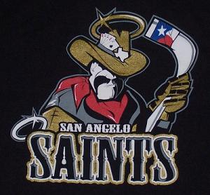
I was saddened today to read the news that the San Angelo Saints of the Central Hockey League had suspended operations. I'm not sure how I missed it, but they closed up shop in April right in the middle of the season meaning that I'm only three months behind the times. I'm so far behind that I couldn't find a big version of their secondary logo (above) anywhere on-line so I had to take a picture of my t-shirt. Sadly this means that one of my all-time favorite logos is going extinct.
Last week I talked about how much I love simplicity. Well, the Saints logos are the exact opposite of simple. In fact, they may be the most complicated logos ever to grace the front of a hockey jersey and that's why I love them.
First lets look at the secondary logo at the top of this post. The first thing you notice is how incredibly detailed his face and body is. He looks like a Texas cowboy through and through. He's got the mustache, the big chin, the leathery face, the bandana and the hat. If you just left it at that, it would work as a logo by itself. But they added all sorts of little details to spice him up. The Texas flag on the hockey stick, the aces and eights in his hat. The shape of Texas on his hat, the lonestar halo. They say that everything is bigger in Texas. Well this logo is supersized and they fit everything you could possibly think of into it.

Now the primary logo (above) isn't as detailed and until today I didn't really care for it as much as the secondary logo. It still has a lot going on in it, the lonestar halo, the flag on the stick and San Angelo marked on the map behind him, but I never understood what he was kneeling for. But I read an old article at SSUR.org that explained what he is doing and it is one of the best explanations ever.
“It’s based off St. Michael," (Saints GM Daniel) Chaput explained. “Most pictures of him, he’s seen with a sword stabbing the devil. We have a West Texas version of that."
Wow! Have you ever heard of a sports franchise that can explain their logo in such terms. So he's stabbing the devil with his hockey stick. That explains everything. Awesome!
I now think that the San Angelo Saints primary logo is one of the most intelligent and brilliant logos in the history of sports. I saw the secondary logo a few years ago and immediately ordered a t-shirt blown away by the detail. Had I known the little tidbit about St. Michael and their primary logo I would have purchased one of those t-shirts as well.
Alas, the Saints are no more. They were not blessed with good attendance despite the brilliance of these two logos and I was too late to find out about their passing to take advantage of a closeout sale.
posted by Brandon @ 11:38 AM
![]()
![]()


1 Comments:
From Ventura/Oxnard currently in Chandler, AZ. Just looking for a logo for my fantasy baseball team the Diamond Dawgs. I work for your biggest franchisee in the retail segement. 99 cent coffee gonna become a reality?
Post a Comment
<< Home