
From the SLP Archive: Jamestown Jammers
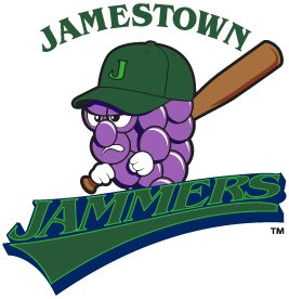
I don't know how this new logo for the Jamestown Jammers of the New York-Penn League slipped under my radar for so long, but now I long for those carefree days of sweet, ignorant bliss.
The Jammers had a pretty awful logo to begin with, but you would expect that with change would come improvement. Sadly, that is not the case. I thought that minor league baseball had progressed past these cheap looking designs. There have been some bad, cartoony logos introduced over the past few years, but at least they look professionally done.
This is, without a doubt in my mind, the worst logo in baseball and it rivals the Charlotte Krunk for the worst logo reviewed on the SLP. Please, let us put this logo behind us and move forward to bigger and better things. I encourage the Jammers to do the same thing.
posted by Brandon @ 11:59 PM
![]()
![]()


0 Comments:
Post a Comment
<< Home