Friday, April 11, 2008

Seattle Sounders FC


I am so happy that Seattle's new Major League Soccer ownership group listened to the fans on the naming of the team that I'm willing to look past the awkward blue shield in their new logo. The fact that the team will be called the Sounders is enough of a victory for me.

I don't even mind the FC part. I understand the need to differentiate between this team and the current, original Sounders. That makes perfect sense to me.

And I'm not just saying that because I plan on applying for a job with them and I'm super nervous about my Googleability. I'm moving back up to Seattle in July and I'd love to be in on the ground floor of a new franchise. I would've wanted to work for whatever they called the team, it's just a bonus they are the Sounders.

However, I do think this concept I wrote about last year is a far superior logo.

DAY AFTER UPDATE - After I wrote this review last night and read Dave's comment, I went to bed and while trying to fall asleep I thought more about the Sounders logo. I've come to the sad conclusion that I can't overlook the faults just because of the name. In fact, because I love the name so much, I really feel cheated now by this lackluster effort.

I mentioned the second, blue shield that doesn't make any sense to me. I guess it was simply a way to get that blue somewhere in the logo. But how about this concept - a ten minute tweaking by jl murtagh on the Sportslogos.net forums. So much better, so much cleaner, improved upon by an amateur.

While that eliminates the unnecessary shield, two major problems still exist. First, the lettering. It's pretty obvious to me that they selected this logo long ago and left the name banner blank so they could fill it in when the time came to name the team. That being the case, the logo doesn't reflect the name Sounders at all and the lettering itself if just a basic font with just a tiny bit of embellishment. Nothing interesting or unique or eye-catching or marketable. Just a name, in normal font. Whoopee.

But what gets me the most is the design of the Space Needle. It is so basic, so cheap, that I'd expect to find better in the touristy gift shops that are in the Seattle Center. In fact, I'm sure I can probably find the same design on one of those three t-shirts for $9.99 table.

What I didn't think about last night is the missed opportunity that this logo represents. This could've and should've been so much better. This is a weak effort and whoever designed it can't really be proud of it. I bet it ended up being a logo by committee, and no logo looks right after that process.

As it stands now, this isn't an ugly logo, just a poorly designed one and it would've been no matter what name filled that banner.


Team: Seattle Sounders
League: Major League Soccer
Location: Seattle, Washington
Stadium: Qwest Field

Labels: ,


Thursday, November 08, 2007

UC Santa Barbara Soccer vs. Cal Poly

Last year I saw the video on YouTube of the UCSB students marching through Isla Vista with a soccer goal after the Gauchos won the NCAA National Championship and thought to myself, "gee, I guess I should've gone to a game this season". But despite the fact I knew that their team was good, I didn't understand the level of student support that Gauchos soccer received. Soccer at most schools, even if the team is really good, doesn't get much student support and usually isn't something to go out of your way to attend. That isn't the case at UCSB, as I heard one student say on Saturday night "we don't have football, our basketball team usually sucks....this is kind of our thing."


So I finally took in my first Gauchos soccer game this past weekend when they took on Central Coast rival Cal Poly. Earlier this season, the Mustangs beat the Gauchos 2-1 in front of a crowd of over 7,000 up in San Luis Obispo. Even though both teams are good and it's a pretty fierce rivalry, if Poly wouldn't have won that game, Saturday's game might have just been a little better than average crowd-wise. But that game really fired up the faithful on both sides and despite cold, foggy conditions, 8,100 rabid soccer fans packed into Harder Stadium and created an atmosphere for collegiate soccer that I had never experienced or ever expected.


My first inkling of what I was in for was when I arrived to campus and found that there wasn't a parking spot anywhere near the stadium. I had to drive around for a while and finally found a parking garage where most people had retreated to park. After a much longer walk than I expected, I finally arrived at the stadium a few minutes after the listed game time only to find a ticket line that stretched all the way across the south side of the stadium. I really didn't think I'd make it in before halftime when I first lined up, but I've got to give credit where credit is due and compliment the ticket booth for making that line move very quickly. I only ended up missing a couple of minutes. It helped that all seating is general admission so people couldn't stand there and mull over their seating options.


Once inside, I took a seat behind the Cal Poly student section only because it was at the end of the field that the Gauchos were on offense. The Mustangs dominated the first half and scored a beautiful goal that silenced the Gaucho crowd and let the Poly students puff out their chests and have their moment of superiority for at least a few minutes.


During halftime I moved around to the other end of the stadium, again to be close to the goal that UCSB was shooting and to be much closer to the Gauchos student section. I'm sure glad that I did because not too long into the second half the Guachos scored their first goal and the place went absolutely crazy. Then, minutes later, they took the lead and Harder Stadium exploded into joyous celebration. I've been to a lot of sporting events. I have seen touchdowns, I have seen last second shots, I have seen a lot. But I don't know if I've ever seen a crowd collectively lose their minds the way they did after that second goal. It was incredible, serious goose bump kind of stuff. Not too long after that, the Gauchos added their third goal and I found myself jumping up and down and high-fiving strangers.


At the end of the game, the students rushed the field...at a soccer game. That was a first for me and was a very impressive showing of how important soccer is to this university.


Best seven dollar sports ticket I ever purchased.

Labels: , ,


Monday, October 08, 2007

Seattle Sounders - MLS Concepts


They guys over at GOALSeattle.com are nervously reporting that October 11th could be the day that the MLS announces that they have awarded an expansion franchise to Seattle. I'm all for it. I've now been to a couple of MLS games and was won over and I definitely think it could do well in Seattle. I wish there was a soccer specific stadium in town rather than the massive Qwest Field, but I'm not willing to have taxpayers pay for yet another unnecessary stadium.

My hope is that Seattle MLS, headed by current Sounders owner Adrian Hanauer, will stick with tradition and take the Sounders nickname with them. I personally can't imagine a Seattle soccer team that isn't called the Sounders. I almost don't think it would be worth having an MLS team in town if they wouldn't be called the Sounders. Seriously, that's how much I love that name.

Above you see my favorite of the concepts done by Luminous Creative that GOALSeattle obtained (click here to see the others). It's the only one that he did that incorporates the Sounders name with the FC Seattle or Seattle FC that many are suggesting will be used. I love the use of Chief Sealth, the man Seattle is named after and the symbol of the City of Seattle (this is an exact replication of Sealth from the city's logo) and I like that he retained the blue and green that the Sounders have used all along.

Too bad the Seattle MLS group appears to have hired a different firm, hence the availability of these concepts online. Oh well, as long as they remain the Sounders and improve upon their current logo, I'll be plenty happy.


Team: Seattle Sounders
League: Current - USL First Divison... Proposed - MLS
Location: Seattle, Washington
Stadium: Qwest Field
Merchandise: Get the current, OK logo before it's gone

Labels: ,


Wednesday, August 29, 2007

Houston Leones

Ok, I'm going to give you fair warning before I show you this logo. It is one of the most disturbing and nightmarish logos that I've ever seen.

Earlier this month the United Soccer League announced the arrival of the Houston Leones (thanks to SLP advanced scout Jesse Acevedo for alerting me). The team will play it's home games at owner Juan Carlos Hernandez's Soccer World Center in Richmond, Texas. Because they will be totally in control of their own stadium and because of Hernandez's close ties to the local Hispanic community, the USL and the Leones expect to be very successful, and I'd be willing to bet that they will do quite well for themselves.

You know, I think I need to become a successful developer with the resources to just build my own stadium. I can't find a link, but apparently this Soccer World Center is a 17 -acre facility that has three fields including the main stadium that seats 4,500 fans and is able to expand to a 8,000 - 10,000 capacity. I should have something like that for baseball. All it would take is the business know how and years and years and yeas of hard work.

So maybe I won't be building my own facility, because I know nothing about real estate or construction. But if Juan Carlos Hernandez would be willing, I'd gladly accept a gift of a baseball stadium from him. Please Mr. Hernandez?

Ok, enough talk, it was just an excuse to make sure that the hideousness of their logo is below the fold. I'm sure this team will be successful, but this logo isn't going to do them an favors. It's bad...scary bad. It's haunted my dreams since Jesse first emailed it to me. Consider yourself warned, I cannot be responsible for what happens here on out...


Sleep tight! Don't let the Narasimha TEAR YOUR FRIGGING HEAD OFF!


Team: Houston Leones
League: USL Premier Development League
Location: Richmond, Texas
Stadium: Soccer World Center

Labels: ,


Friday, July 13, 2007

Los Angeles Galaxy


I'm going to try something new on the SLP tonight and see what happens. I'm just going to give you the logo and let you say whatever you want to say about it in the comments. Please feel free to weigh in on the LA Galaxy's new logo and then on Sunday night I'll give you my thoughts.

As a little food for thought, here's their old logo and here's a story about the change.

Lurkers - de-lurk!

SUNDAY NIGHT UPDATE - I HATE, HATE, HATE this logo. It is so ridiculously boring and cheap. I can't say that the old logo was great, but it had a ton more life than this joke. I hate the fonts that they used, I hate how all of the letters in the "GALAXY" look like they are tipped the wrong way, I hate all the dead space...I just plain HATE it. I think this logo is awful.

And I hate that they introduced it mid-season, I hate that they did it only because Beckham is on his way and they want to force people to buy merchandise, and I absolutely hate that that you can only get jerseys with the Herbalife sponsor across it. Herbalife is a creepy pyramid scheme and I would never pay to advertise them.

I will have a lot more to say about the MLS tomorrow. I want to like the MLS, in fact I went to my first Galaxy game last week and had an absolute blast, but this whole Beckham precedent and a lot of the other things that they are doing rubs me the wrong way. I don't think I'll ever be able to take this league seriously even though I want to.

Team: Los Angeles Galaxy
League: Major League Soccer
Location: Carson, California
Stadium: Home Depot Center - here's my review on Yelp and a few pictures I took.
Online Store: Get your Becks jersey now!

Labels: ,


Wednesday, July 11, 2007

USL Second Division Rankings

In other logo review blogging, today Climbing the Ladder ranked the logos of USL-2. I like his list, mine would be just a little bit different, but we both agree on the best logo, the Bermuda Hogges, and the two worst logos.

He says that he is planning on ranking the USL-1's logos and at least ten of the PDL's best logos. I don't envy him one bit for tackling the PDL, I was just going through it and some of those logos are brutal. I can't say that there is even one that jumped out as the best.

If he does the PDL, let me nominate my hometown Ventura Fusion for the top ten.

Labels:


Monday, December 04, 2006

Ventura County Fusion

A professional sports franchise is finally coming to my adopted hometown of Ventura, California and unlike the last professional team to announce their arrival (the California Eagles of the ABA), this one has a chance to become wildly successful.

Ventura County, in all of it's bigness (four cities over 100,000 residents), is a wasteland for professional sports. For one season in the 80's the Ventura Gulls played baseball at Ventura College and at one point the independent Western Baseball League Pacific Suns were slated to play in Oxnard, but since then nothing has come to fruition. The simple fact that there isn't a suitable arena, baseball stadium, soccer field or jai alai court in the entire county is the main culprit.

However, with Ventura College's new, 8.1 million dollar athletic complex featuring a 3,000 seat track and field, football and soccer stadium being constructed right now, suddenly a state-of-the-art facility will finally be in place and ready for Ventura County's only professional franchise.


Enter the Ventura County Fusion, the newest entry in the United Soccer League's Premier Development League. The Fusion will play eight regular season games at the Ventura College Sports Complex starting in April to the delight of soccer fans throughout the county, and hopefully to the delight of the casual Ventura sports fan.

With season ticket prices at just above eight dollars a game for adults and under five bucks for kids, the price is right. And the way that this community supports it's youth soccer programs and how well they support Ventura College football and basketball, the only affordable family sports entertainment options in the area, if the Fusion play their cards right they could be sitting on top of a huge success. I'm rooting for them, I hope to help them in any way I can and I'm really looking forward to the season.

I even like their logo. Typically it wouldn't be my cup of tea, perhaps my excitement for local professional sports is clouding my judgment. But it's very eye catching and professional and does a great job of introducing this new team to the community. Go Fusion!

Labels: ,


Thursday, April 27, 2006

Manchester United


In honor of my new renter for this week, Manchester United Era (a solid source of information for all things Manchester United), I have declared today, Man U Day here at The Sports Logo Pundit. You may be asking yourself, "just how does The SLP celebrate Man U Day?" Very good question! Like every other day here at The SLP, we celebrate by tearing the Man U logo a new one.

Manchester United's logo blows goats big ti...No, no, no, wait a minute. Man U's logo kicks ass! I mean, the devil is featured quite prominently, although his giddiness kind of puts me off a little bit - that is one happy Satan. There is a ship (maybe a schooner?) dropped into the logo, and in case you didn't know which sport Man U played, there are a couple of soccer balls thrown in for good measure.

This logo pretty much has it all. The devil rocks, the ship is sweet, The colors are bold and interesting, the feel of the logo is very state-of-the-art, but it still retains a classic coat-of-arms look. It's simple, it's understated, and yet it conveys so much and is recognizable throughout the world. It might be as close to a perfect logo as you can get.

Now, I will admit, I am totally and completely ignorant regarding the history of the Man U logo, what the devil and the ship signify, or why the Dark Lord is so cheery. So I call upon our friend over at Manchester United Era to ask if he can give us a little bit of background into this incredible logo.

I think it's the least he can do for ruining the Man U Day celebration I had planned.

Labels: , ,


Monday, April 24, 2006

Tacoma Stars

While trying to randomly pick a logo to review tonight, the big wheel o'logos landed on the brand new Detroit Ignition of the Major Indoor Soccer League. Of course the first question that I asked myself was, "The MISL still exists?" Apparently it does. With teams in Detroit, Chicago, Baltimore, Milwaukee, St. Louis, Philadelphia and Stockton (of all places) the MISL is still trying to make a go of it. In fact, the championship game will be played on ESPN2 Sunday afternoon, so set those Tivos now!


The new MISL got me thinking about the old MISL featuring my beloved, hometown heroes from my childhood, the Tacoma Stars. It was the 1986-87 season, I was all of 10 years-old and my best friend's dad had season tickets, a lot of season tickets. He must have had at least five tickets to every game, because we always had a big group of us go (I doubt they cost any more than $8 a ticket. Plus, looking back, I think they were from his company).

The MISL in the 80's was a really big deal, all of the best players who couldn't cut it in Europe played in the MISL. The Stars had the incredible Preki, Steve Zungul, Godfrey Ingraham, Gary Heale and Ricky Davis. The hated Dallas Sidekicks had, to us, the Michael Jordan of soccer, Tatu. ESPN broadcast quite a few games live, including a couple from Tacoma. This was the big time, especially for a bunch of kids from Olympia.

That season had really strong rivalries with the Sidekicks and the San Diego Sockers, great, flashy players with fun names (Preki and Tatu), a really chintzy LASER show before every game that we thought was the greatest thing ever, the stuff a Volkswagen contest at halftime that was hilarious, and our first freedom from the parents to walk around the arena and act stupid. What more could you ask for from a sport as a 10 year-old? Oh yeah, don't forget the awesome jerseys and the warm glow of the Dome's tacky neon art (see above).

Apparently everybody in Tacoma was just as excited about the Stars as we were. The championship game against the Sidekicks drew an all-time indoor soccer record 21,728 fans to the Dome and we were right there with them. The "foot thunder" in the building that night was deafening (no arena anywhere has louder "foot thunder" than the Tacoma Dome). It was a barnburner of a game, riveting throughout. I think we actually sat and watched the whole thing (quite the feat for 10 year-olds). The game went to overtime but the Stars were eventually defeated 4-3. It was my first taste of Northwest sports disappointment that still plagues me to this day.

The Stars would never be the same. The following season attendance slipped. My friend's dad was laid off and he lost his tickets. My dad had no interest in soccer, so we only went once or twice that season. Thus, my interest waned and by the 1988-89 season, they were barely an afterthought. It didn't help that they folded and a new ownership group was awarded a team that played some games in the itty bitty soccer arena down the road while they fought for use of the Dome. They became a big joke in Tacoma and they eventually faded into obscurity.

I hadn't really thought too much about how great the Stars were during that season until tonight, although it always seems to come up when talking to anybody about the same age that grew up in the area. It was a magical season that left a big impression on everybody that went to a game and Tacoma hasn't seen anything like it since.

God bless you Preki and all of the 86-87 Stars. Thanks for the memories!

Labels: ,


Thursday, March 09, 2006

Red Bull New York


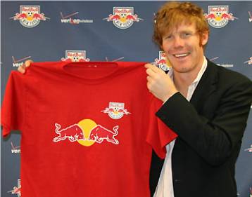
As if I couldn't hate the MLS team names more (FC Dallas, Real Salt Lake, Houston 1836 - I mean Dynamo, DC United), the New York/New Jersey/New Hampshire/New Braunfels/New Caledonia MetroStars have been sold to Austrian based energy drink moguls Red Bull and renamed Red Bull New York or the New York Red Bulls depending on what you read.

I will give it up to MLS for one thing, realizing that they have to do whatever it takes to make money and just sell whatever they can even if it means letting a team be called Red Bull New York or Chivas USA. You do what you have to do to keep the dream, however ridiculous, alive.

But still, like Frinklin said, how can a casual soccer fan (like myself) continue to take this league seriously? These desperate measures to keep this thing afloat are what make the MLS continue to slip even further into the depths of minor league sports. Non-soccer fans in the USA will never, ever be able to get into this sport in the same way that it gets into any of the big three sports, or for that matter hockey, arena league football, minor league baseball, t-ball or Mormon basketball, if they continue the direction they are going.

The MLS has to pick one way or the other soon. But if they continue in the direction they are going they need to stop shoving the idea of soccer as a major sport in the US down our throats, accept their status as a minor league and enjoy their late night spot on The Ocho.

Labels: ,


Tuesday, March 07, 2006

Houston Dynamo


I just want to thank the ownership of Houston's new MLS team for coming to their senses. The Houston 1836 was perhaps one of the stupidest names in all of sports. Not only because it sounded dumb, but because the name alone offended a huge portion of the team's future fans. Thankfully, the team was officially renamed the Houston Dynamo yesterday. It may be boring, but at least it isn't offensive.

Hey, the Sports Logo Pundit has jumped on the Rent My Blog bandwagon. Go check out my renter Haunted House Dressing. He truly has one of the most unique and odd blogs going today.

Labels: ,


Wednesday, February 01, 2006

Houston 1836


The San Jose Earthquakes are gone. Please welcome to Major League Soccer the Houston 1836 joining D.C. United, FC Dallas and Real Salt Lake in a retarded attempt to sound European. Congratulations Houston 1836, you are the most European of them all, in more ways that one.

the 1836 chose their name to honor the founding of the city of Houston, otherwise known as the worst year in this nation's history to anybody who has ever visited that cesspool of a city in the middle of summer. Or for that matter, in the middle of winter, spring or fall. I hate Houston with a passion.

It also is a horrible date for a group of people who are expected to comprise a large part of the 1836 fan base, Mexicans. The secession of Texas and the founding of Houston all came at the expense of Mexicans, and it sounds like they haven't really forgotten it. Add the image of Sam Houston leading the charge against the Mexican army to the logo and you can understand why there might not be too many Latinos proudly displaying their love for their new football team.

So in conclusion...

Fake European MLS names = Retarded
Houston 1836 = Retarded and ignorant
The City of Houston = Retarded, ignorant and squalid
Goode Company BBQ = Only redeeming quality

Labels: ,


Wednesday, June 08, 2005

Harrisburg City Islanders


This is arguably one of the most effective names in all of professional sports. It's not terribly creative or exciting or anything like that, but those aspects are not that important. What makes this name great is that it tells you exactly where the USL's second division Harrisburg City Islanders play...City Island.

City Island sits right smack dab in the middle of the Susquehanna River and is home to both the City Islanders and the Harrisburg Senators baseball team. If you live in Harrisburg or in the surrounding areas, I'd have to imagine you know how to get to City Island. It's a major destination.

So imagine yourself sitting around at home reading the sports page and you notice that the City Islanders are playing tonight. What the hell, you might as well go and check it out, but you've never been to one of their games. No problem, just head onto City Island to the soccer stadium. Pretty simple. No research, no mapquesting, no big deal. People are lazy and some won't take the time to look up directions. This name takes away a major barrier to people coming to see your games. They should know where they are going without any hassle.

I'm not that fond of the logo, although if they are trying to be funny by putting a palm tree and a sun in the logo then I'm fine with it. Otherwise it doesn't really make any sense. But the logo isn't nearly as important or interesting as the choice of name. Kudos to the City Islanders!

Labels: ,


Wednesday, February 23, 2005

Real Salt Lake

Real Salt Lake? Real Salt Lake? I just keep asking myself the same question over and over again. Real Salt Lake? Does it make any sense?

The newest member of Major League Soccer shares it's name with one of the most successful soccer franchises in the world, Real Madrid. That's in Spain which is a country that actually uses words like "real" (pronounced ree-all, which means royal, hence the crown over the "e").

I know that there are a ton of Spanish speaking residents in Salt Lake and the game of soccer is hugely popular in the area. Plus, soccer fans love the tradition of soccer and follow the European game closely. But this is really a reach and a slap in the face of European teams that actually have tradition. It's like starting a minor league baseball team in say Biloxi, Mississippi and calling them the Yankees. Just because it's traditional doesn't make it a good idea.

What's next? I've heard that the MLS is going to expanded up here to the lovely Pacific Northwest. I have some great team name ideas for them if the do...
  • Gold Bar FC
  • Club Deportivos Tillicum
  • Sea-Tac United
  • Real Forks
  • AC Walla Walla
  • Manchester United - Concrete
  • AC Real Club Deportivos Soap Lake United

Labels: ,