Sunday, April 09, 2006

Jamestown Jammers


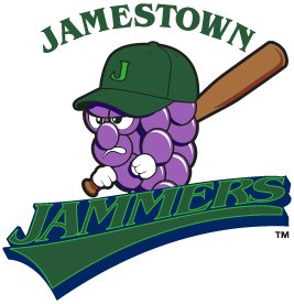
I don't know how this new logo for the Jamestown Jammers of the New York-Penn League slipped under my radar for so long, but now I long for those carefree days of sweet, ignorant bliss.

The Jammers had a pretty awful logo to begin with, but you would expect that with change would come improvement. Sadly, that is not the case. I thought that minor league baseball had progressed past these cheap looking designs. There have been some bad, cartoony logos introduced over the past few years, but at least they look professionally done.

This is, without a doubt in my mind, the worst logo in baseball and it rivals the Charlotte Krunk for the worst logo reviewed on the SLP. Please, let us put this logo behind us and move forward to bigger and better things. I encourage the Jammers to do the same thing.

Labels: , ,


Saturday, October 08, 2005

Daytona Beach Thunder


Let's crank the old Sports Logo Pundit back up. I have a new desk chair that doesn't make my butt hurt after sitting on it for five minutes like the folding chair that I had been using did, meaning that I can sit here for long stretches and look for logos to rip on. Sounds great!

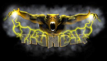
Anyway, the last logo we looked at back in August was the Charlotte Krunk, a logo that looked like a middle school student may have sketched it on his notebook. Today's logo, the Daytona Beach Thunder of the Atlantic Indoor Football League is the exact opposite utilizing at least a little bit of technology. The problem is I think I would rather have the Krunk boombox on my pee chee over the Thunder's....thunder monster?

Seriously, what the hell is that thing? At least I know what a boombox is even if it is trying to dunk a basketball. But this thunder monster is just plain scary and ugly, very ugly. I just can't figure out what it is supposed to be. Did they just lift it straight from a video game somewhere? Does it have anything to do with football or Daytona Beach? Is it what your girlfriend looked like when she found out you cheated on her during your Spring Break trip to Daytona Beach?

Whatever it is, it sure is nasty and, along with the Binghamton Brigadiers, it is yet another embarrassing logo to come out of the AIFL.

P.S...You have to read this press release about the Thunder's dance team changing their name. It is hilarious.

Labels: , ,


Monday, August 22, 2005

Charlotte Krunk

First of all, sorry about the extended layoff. I had to take a step back from sports logos just for a minute and catch my breath. Don't really know why, just didn't feel like writing any logo reviews. It happens.

Recently I have been pondering the existence of the California Eagles of the ABA here in Ventura, California and I started to think about how this area has a professional sports void. There isn't a single professional franchise in Ventura County or even in Santa Barbara County despite it's size and affluence. The Eagles could possibly find a niche in this market if run right and could ultimately help someone in this county decide to build a suitable home for a professional sports team.

This made me think long and hard about how the ABA may not be all that bad. It does give people an opportunity to own a professional sports franchise and run it with extremely low costs and lets them see what they can do. I started thinking that maybe these owners aren't ridiculously stupid, like I've previously thought, throwing their money at a bunch of shysters for absolutely no payoff. I really started to think the ABA could become a model for other professional sports leagues in the future.

Then I was knocked back to the sad reality of what a joke the ABA is when I saw this logo...

Disband the ABA now! Any league that would allow a team to be called the Krunk and have a logo this unprofessional should immediately be seized by the authorities and turned over to somebody who actually knows what they are doing.

Seriously, the Charlotte Krunk wouldn't even be an acceptable name for a fantasy league team. And the logo? Well, I can't find the proper words to describe just how horrible this logo is. Let me just put it this way...I think I drew that on a pee chee or my school binder during my Electric Boogaloo stage when I was seven or eight years old. I thought I had lost that pee chee years ago, but apparently the Krunk's owner, Spyder D, found it floating around somewhere. I would want some royalties, but I am too embarrassed to claim that that was my artwork even though I was in the second grade when I drew it. It is still too shameful.

Labels: , ,


Thursday, July 07, 2005

Binghamton Brigadiers

The Atlantic Indoor Football League is ambitiously expanding attempting to go from six teams in this it's inaugural year to sixteen teams next season. This week it was announced that the Binghamton Brigadiers would be joining this fledgling league and will play it's home games at Broome County's Veterans Memorial Arena, which I can tell you from experience is a very nice arena for hockey and most likely a good place to watch some football.

Now, I'm all for the name. The Brigadiers is unique. There isn't another minor league franchise sporting that moniker and Benjamin Tisdale's (the owner) reasoning is very admirable. The name relates to his service in the military for the last twenty years, the region's ties to the military and the fact that they are playing at Veterans Memorial Arena.

But is it just me or does the logo look like a particularly twisted and demonic potato? That is one pissed off spud if you ask me. He's no happy go lucky Mr. Potato Head. No, he's about to kick some ass and take some names. He's been made a one-star general and it's gone straight to this papa's head.

Seriously, I hate to say it but this is one ugly logo. Unfortunately, it is so ugly that it doesn't even have endearing qualities the way some ugly logos do. The color scheme is gross, the potato looks possessed, and he has been wounded and now doesn't have any arms. It pains me to say and I apologize to Brigadiers management if they read this, but this might be the ugliest logo that I have reviewed so far on the Sports Logo Pundit. May it not get any worse than this.

Labels: , ,