
Laredo Broncos
The United Baseball League opened their inaugural season tonight with three games including Central Baseball League holdovers San Angelo hosting the brand new Laredo Broncos and the Rio Grande Valley WhiteWings returning to Harlingen to face the hated Edinburg Coyotes, the replacement for the team that essentially forced the WhiteWings to close up shop a few years ago.
I'm very interested in this league because of my ties to Harlingen and the Rio Grande Valley WhiteWings. I really want to see this league succeed if only to prove that these markets can be successful under the right leadership and if they are given the proper resources, something that we desperately lacked when I was working down there. The key is relating to the Mexican population. Harlingen is probably 80% Hispanic and yet we didn't capitalize on that number at all. Show the Mexicans some love and I would bet they would come out.
But that's another topic for another day. Let's forget about it for just one second so I can properly critique a logo.
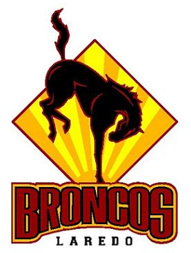
Two of the league's logos are new for the 2006 season, while the others are using old logos from teams past. Of the new logos, I have already reviewed the Edinburg Coyotes, a jumbled, incoherent mess of a logo. As for the Broncos, The ULB did a little bit better job, it isn't awful. But there is definitely something wrong with it and ultimately I don't particularly care for their inaugural logo.
The color scheme is nice and the sun in the background is a good little touch. But the font on BRONCOS is extremely dull and looks forcibly squeezed together. The Bronco itself has nice detail but looks like it is doing a handstand rather than bucking. It lacks any kind of action.
Also, though not to be crude (gee that wouldn't be in my nature, would it?), am I the only one that thinks the tail doesn't look like a tail? When I first took a look at this logo as a thumbnail on Our Sports Central, I did a double take. My first thought was that there is some kind of noxious gas rising from the backside of the Bronco. Obviously, once I really looked at the logo, I found that I was wrong. But still, the tail doesn't look right and it makes the logo look lopsided and out of whack.
All of this doesn't mean that I won't be rooting for the Broncos. Laredo is a huge, growing city that has whole heartedly supported minor league hockey and typically supported Los Tecolates before they left Dos Laredos. It would be nice to see baseball finally survive and thrive down on the border.
I'm very interested in this league because of my ties to Harlingen and the Rio Grande Valley WhiteWings. I really want to see this league succeed if only to prove that these markets can be successful under the right leadership and if they are given the proper resources, something that we desperately lacked when I was working down there. The key is relating to the Mexican population. Harlingen is probably 80% Hispanic and yet we didn't capitalize on that number at all. Show the Mexicans some love and I would bet they would come out.
But that's another topic for another day. Let's forget about it for just one second so I can properly critique a logo.
Two of the league's logos are new for the 2006 season, while the others are using old logos from teams past. Of the new logos, I have already reviewed the Edinburg Coyotes, a jumbled, incoherent mess of a logo. As for the Broncos, The ULB did a little bit better job, it isn't awful. But there is definitely something wrong with it and ultimately I don't particularly care for their inaugural logo.
The color scheme is nice and the sun in the background is a good little touch. But the font on BRONCOS is extremely dull and looks forcibly squeezed together. The Bronco itself has nice detail but looks like it is doing a handstand rather than bucking. It lacks any kind of action.
Also, though not to be crude (gee that wouldn't be in my nature, would it?), am I the only one that thinks the tail doesn't look like a tail? When I first took a look at this logo as a thumbnail on Our Sports Central, I did a double take. My first thought was that there is some kind of noxious gas rising from the backside of the Bronco. Obviously, once I really looked at the logo, I found that I was wrong. But still, the tail doesn't look right and it makes the logo look lopsided and out of whack.
All of this doesn't mean that I won't be rooting for the Broncos. Laredo is a huge, growing city that has whole heartedly supported minor league hockey and typically supported Los Tecolates before they left Dos Laredos. It would be nice to see baseball finally survive and thrive down on the border.
posted by Brandon @ 11:58 PM
![]()
![]()


2 Comments:
The Mexicans come to shop at the mall on weekends and go home. Hispanics are the ones enjoying baseball at these venues. I agree, the Bronco looks like it's doing gymnastics in front of a street sign.
That's funny Brandon. I thought the same thing about the Bronco!!!!
Post a Comment
<< Home