Wednesday, May 25, 2005

Lansing Lugnuts

Like I said before, basically all I'm doing for these random reviews is going to OurSportsCentral, closing my eyes and clicking a whole bunch and wherever I land is what I review.

Today I landed on the
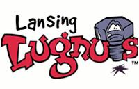
Lansing Lugnuts. But really, what else can possibly be said about the Lugnuts logo that hasn't been said already. But I guess I'll have to say it anyway. THAT ISN'T EVEN A LUGNUT!!! IT'S A BOLT!!! Someone obviously didn't have a dictionary around when they designed this logo.

Other than that glaring mistake this logo isn't that bad. Sure it ushered in a ton of cheesy, goof ball logos after it was launched including the Lugnuts sister team, the
Montgomery Biscuits. But at least it was original at the time.

Oh hell, I can't sugar coat this one. To me, the Lugnuts are to blame for a ton of the bad logos we see today. I wish it would have been stopped right away. But it is very popular, so who am I to judge?


Labels: ,


Tuesday, May 24, 2005

Arizona Heat


Today's random review subject is the Arizona Heat of National Pro Fastpitch, a loosely organized league of six teams stretching all the way from Lowell, Massachusetts to Tucson, Arizona. The Heat play their home games at Hi Corbett Field in Tucson, the former home of the Tucson Toros and current spring training home of the Colorado Rockies. After the Rockies leave they convert the field to a softball setup and keep it that way for the Heat all season. This is easily the nicest facility in the league.

Now onto the logo. First of all, let's totally ignore the fact that every other women's fastpitch team is called the Heat. Seriously, there were at least ten different Heat fastpitch teams in little old Olympia, Washington while I was growing up and I can only assume that it continues to grow. Let's also ignore how easy it is to name your team the Heat in Arizona, not a ton of imagination there.

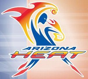
Ignoring those factors I would give this logo a big thumbs up. It's very striking when you see it for the first time and immediately catches your attention. It's very exciting and very animated and also does a great job of explaining what the Arizona Heat are. It's hard to mistake that pose for any other sport than fastpitch (except maybe hardcore lawn bowling).

It also does a good job of illustrating the feminine. Sometimes women's logos go to far with this giving them far too shapely a figure or humongous chests or whatever, but this one does a great job of suggesting it without shoving it down your throat. It's obvious that it is a women's team without being exploitative about it.

So kudos to the Arizona Heat for their logo. Now if only we can work on that name. It really is just too much of a cliche for me. If you are in Tucson and interested, the Heat open their season on May 26th at 7:30 PM against the Phoenix Flames.

Labels: ,


Saturday, May 21, 2005

NLL Dance Teams

I think one of the funniest things about Arena Football League teams or, in this case, the National Lacrosse League teams, is the names of their dance teams. They are always so cheesy, kind of like the cheer squads themselves. In the AFL the best example I can think of is the San Jose Saberkittens. How demeaning and lame is that? On the other hand they are cheerleading for an Arena Football League team so how much pride do they have in the first place?

The NLL has some pretty lame ones. Nothing like just slapping an -ette at the end of a word or implying that they really are just a bunch of groupies. I guess I was also surprised to see that the NLL even had dance teams. I guess you have to do something at these games. Anyway, here's a quick list of the NLL Dance Teams...

Storm Chasers - Anaheim Storm
Stingettes - Arizona Sting
Bandettes - Buffalo Bandits - Personally I think they should be called the Band Aids
Drill Crew - Calgary Roughnecks - Ladies, don't let the players start their own "drill crew"
Wild Bunch - Colorado Mammoths
Swarm Performance Team - Minnesota Swarm - Yawn. I was hoping for "The Queen Bees"
Knightingales - Rochester Knighthawks
Hot Rocks - Toronto Rock - What? The Rockettes was already taken?

None of these are as bad as the NBA's Indiana Pacer's dance team,
the Pacemates. At that point you might as well just call them "the bunch of chicks we hired to dress in skimpy outfits and parade around for you to ogle but only get paid a little above minimum wage who might start banging the players at any time."

Labels: ,


Thursday, May 19, 2005

New Mexico Scorpions

Today's random review is the New Mexico Scorpions. The Scorpions just announced this week that they will be taking the 2005-2006 season off to wait for their new arena to open in 2006. I'd imagine that when they move into the new building they will also opt to change their image so this means that this could be an obituary for a dead logo as well as a random review.

And die it must. Actually, that's a bit harsh. The separate parts of this logo are pretty cool. Take them apart and you might have something. The southwestern pattern in the background is a very nice touch and the scorpion holding a hockey stick even manages to look pretty cool by itself.


But together they are a mess. It's like they had two different logos and decided to put them together but failed to realize that five drastically different colors in one logo was overkill and that maybe they should move the scorpion around and somehow eliminate some of the dead space in the background.

The good news is that they now have over a year to get their act together and improve this logo before resuming play. At the very least they could settle on three, hell, even four matching colors. It sure would be nice to look a little better when they open up their new digs in Rio Rancho in 2006.

Labels: ,


Wednesday, May 18, 2005

Lancaster JetHawks


Today's random review is the Lancaster Jethawks of the California League. I randomly selected this logo by closing my eyes and clicking on links at OurSportsCentral. What's weird is that this is a team I've been following a bit because it is one of the closest minor league teams to where I'm moving in a couple of weeks. Kind of creepy.

Anyway, I love this logo and have since I first saw it simply because of the cool lettering. No other lettering better symbolizes the aviation history and space age that is such a big deal in Lancaster and that the JetHawks name represents. Edwards Air Force Base has had a major impact on Lancaster (it may even be the real reason Lancaster exists) and this logo honors that link to near perfection.


Even the screaming JetHawk is a nice touch. I usually hate it when teams turn an inanimate object into a cute mascot just for kicks but this one does a good job of keeping it toned down and not making it the focal point of the logo. Plus, it reminds me of old World War II art that you would see on patches or flags.


So, overall, this is a great logo, one that does just about everything right. From the name honoring the area's aviation history to the cute mascot that isn't over the top to the lettering that brings you back to the space age, the Lancaster JetHawks logo is top notch. Not too bad of a choice for my first random review.

Labels: ,


Tuesday, May 17, 2005

Aloha and Mahalo!

Aloha everybody! Thanks for your patience while I got married last weekend and basked in the hot Maui sunshine during my honeymoon. It was an incredible wedding and the best vacation I've ever been on. It's hard to go back to work and hard to bring myself to sit at a computer and write on my blogs but I guess that it's time we fired this bad boy up again.

Also, thanks to Frinklin for volunteering to write a couple of guest blogs. Unfortunately I missed his email and never got it set up. I'm moving to California in a couple of weeks and I'll probably ask him to do some writing when I'm away from the computer for the week or so it will take me to pack up and get down there.

As far as the SLP goes, I've decided to revamp the content a bit. I started this blog with the intention of randomly picking a logo everyday and quickly reviewing it. But I got sidetracked and started reporting news about logos and writing long winded stories and whatnot. Suddenly I ran out of things to say and totally lost the focus.

My goal for the next couple of weeks and hopefully beyond is to do what I wanted to originally do. So look for more quick reviews of random logos rather than just news stories. Hopefully I can find time on a daily basis to do this and I swear I will try my best to write more often than I have been. You can expect a new review sometime tonight!


Wednesday, May 04, 2005

RIP: Bangor Lumberjacks


The Bangor Lumberjacks are no more. Yep you heard it here first (that's a big lie, the story is over a week old, I'm just really slow). In an attempt to chronicle the passing of franchises and to preserve their logos I bring you the Lumberjacks logo above. In the grand scheme of things it's not that memorable of a logo. But at the very least it is a lot of fun and I'm sure was well liked by their fans.

Personally I'm very sad to see the Lumberjacks shut down. Their previous incarnation, the Adirondack Lumberjacks, were our fiercest rival when I worked for the Elmira Pioneers. Les Lancaster and the rest of those guys just rubbed everybody from the players to the coaches to the owners to the front staff the wrong way for some reason.

But it was always fun to have them come into town. We all shared a weird bond that was unexplainable. It just meant more when we played them. Plus I love their logo. It's one of my all time favorites. It's so clean and simple and looks great on a cap (I have two of them)...but I digress.

Now the Can-Am League is left on very unstable ground again. I'd be willing to say that there is only one, maybe two teams that are solid (Brockton and maybe North Shore). New Jersey and Quebec have good ownership but both have seen their attendance dwindle over the years. Elmira is in danger of losing the funding for historic Dunn Field and always seems to be on the verge of going under. New Haven barely drew 1,000 fans last year to Yale Field and Worcester is an expansion team playing in a very small collegiate ballpark.

These questions don't bode well for the Can-Am League's future. They have solid leadership and should be able to survive but only time will tell. If things go really poorly this very well could be the last season for the Northeast/Northern/Northeast/Can-Am League. I sure hope I don't have to write one of these obituaries for them next year.

Labels: ,


Monday, May 02, 2005

Help Wanted: Guest Bloggers

I've been debating whether or not to ask for some guest bloggers while I'm away getting married this weekend and on my honeymoon next week. On one hand I'd love to get some more people involved and keep this thing rolling (actually it will probably be busier since I've been slacking) but what if I'm totally upstaged? Will I ever muster the courage to write again? Damn you lack of self-confidence! Just kidding! No I'm not. Yes I am. No I'm not. Yes I am, No I'm...

Anyway, despite my fears I think I'll open it up to a couple of guest bloggers. So if you are interested in writing a couple of reviews for the Sports Logo Pundit then drop me an email at downwithpants@gmail.com. I'd love to have your help.