
New Mexico Scorpions
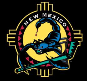 Today's random review is the New Mexico Scorpions. The Scorpions just announced this week that they will be taking the 2005-2006 season off to wait for their new arena to open in 2006. I'd imagine that when they move into the new building they will also opt to change their image so this means that this could be an obituary for a dead logo as well as a random review.
 And die it must. Actually, that's a bit harsh. The separate parts of this logo are pretty cool. Take them apart and you might have something. The southwestern pattern in the background is a very nice touch and the scorpion holding a hockey stick even manages to look pretty cool by itself.
But together they are a mess. It's like they had two different logos and decided to put them together but failed to realize that five drastically different colors in one logo was overkill and that maybe they should move the scorpion around and somehow eliminate some of the dead space in the background.
The good news is that they now have over a year to get their act together and improve this logo before resuming play. At the very least they could settle on three, hell, even four matching colors. It sure would be nice to look a little better when they open up their new digs in Rio Rancho in 2006.
Labels: Hockey, New Mexico
posted by Brandon @ 11:54 PM
![]()
![]()


0 Comments:
Post a Comment
<< Home