
Lancaster JetHawks
Today's random review is the Lancaster Jethawks of the California League. I randomly selected this logo by closing my eyes and clicking on links at OurSportsCentral. What's weird is that this is a team I've been following a bit because it is one of the closest minor league teams to where I'm moving in a couple of weeks. Kind of creepy.
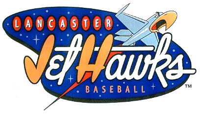
Anyway, I love this logo and have since I first saw it simply because of the cool lettering. No other lettering better symbolizes the aviation history and space age that is such a big deal in Lancaster and that the JetHawks name represents. Edwards Air Force Base has had a major impact on Lancaster (it may even be the real reason Lancaster exists) and this logo honors that link to near perfection.
Even the screaming JetHawk is a nice touch. I usually hate it when teams turn an inanimate object into a cute mascot just for kicks but this one does a good job of keeping it toned down and not making it the focal point of the logo. Plus, it reminds me of old World War II art that you would see on patches or flags.
So, overall, this is a great logo, one that does just about everything right. From the name honoring the area's aviation history to the cute mascot that isn't over the top to the lettering that brings you back to the space age, the Lancaster JetHawks logo is top notch. Not too bad of a choice for my first random review.
Labels: Baseball, California
posted by Brandon @ 9:34 PM
![]()
![]()


0 Comments:
Post a Comment
<< Home