Wednesday, February 14, 2007

Webster University Gorloks

A big Sports Logo Pundit thank you goes out to graphic designer Benjamin Shown (check out his website, he's done some pretty fine work himself) for alerting me to the new athletics logo for his Webster University Gorloks. I guess I should also thank him for alerting me to the existence of Webster University in general. Somehow I had never heard this school.

"What's a Gorlok?" you ask. Don't worry, I had no idea either. According to the Webster University website a Gorlok is " reported to have the paws of a speeding cheetah, the horns of a fierce buffalo and the face of a dependable Saint Bernard. The myth of the Gorlok embodies the highest standards of speed, agility and stamina in an atmosphere of fairness and good conduct." The name was derived from two intersecting streets in Webster and was first used as their nickname in 1984.

The new Gorlok athletic logo (above) debuted in October after years of using a goofy, seemingly hand drawn Gorlok (right). Because of the old logo's amateur but accessible and unique quality, I think was a tough task for the designer and for the school to come up with something acceptable to all. How do you take a logo that has it's own homegrown, goofy, beloved spirit and give it a sleek modern look without losing what makes it unique?

The new logo does lose a little bit of that spirit, but I think that it does a better job of fulfilling the description of what the Gorlok is. It definitely "embodies the highest standards of speed, agility and stamina" better than the old logo who, to me, looks more like John Belushi in Animal House than a dependable Saint Bernard.

But in case you don't like the sleek new logo and prefer the old Gorlock, fear not. Both logos are still in use throughout Webster University today.

Team: Webster University Gorloks
League: St. Louis Intercollegiate Athletics Conference (Division III)
Location: Webster Groves, Missouri
Facilities: Facilities include GCS Stadium, home to the Gateway Grizzlies

Labels: ,


Tuesday, May 23, 2006

Sikeston Bulls


One of my favorite trends in baseball is the emergence of the collegiate wood bat teams and their desire to become a part of their community and actually draw crowds to their games. Around the country, owners are realizing that with just a little bit of effort and not that large of a financial investment, they can dramatically increase their attendance and basically cover their costs while providing affordable, family entertainment in markets and ballparks that aren't up to standards set by independent leagues let alone the Minor Leagues. Recent success stories include the Wenatchee Applesox, the Madison Mallards and the La Crosse Loggers.

This season the Sikeston Bulls of the KIT League are hoping that with a little bit of investment, they too could join that list of successes. Last season, under different ownership, Sikeston played host to the Bootheel Bombers, a team that operated under the long standing tradition amongst summer wood-bat leagues of just opening the gates and hoping someone will come.

Obviously, this didn't work out too well and the team was sold to a group willing to do a little more. They hired a general manager with Minor League baseball experience, they changed the name of the team and introduced a new logo that both capitalizes on an already familiar brand in Sikeston, the Bootheel Rodeo, and creates an eye-catching brand unique to the Bulls.

I love this logo for many different reasons. First of all, I think it's great that a team this small recognizes that branding is one of the most important things you can do when trying to establish a new direction for a team. If they just trotted out some retread logo designed on the cheap that doesn't look professional, who would take them seriously? What changed?

Luckily the Bulls recognized their opportunity and went with a logo that perfectly balances a simple, classic style with modern, digital design. The bull is a great example. It is very detailed and striking, obviously designed on a computer. But it doesn't go for the throat by being overly animated like you see in many similarly designed logos.

The "Bulls" script is pretty basic with the horns on the ends for good measure. It's nothing new but it does stand out and will look great on a jersey. But my personal favorite element is the simple "Sikeston" script. It's a script that you rarely see anymore, but was used quite often on jerseys in the 40's and 50's.

But the "Sikeston" script works on another level. This is going to sound funny, because now I'm getting into kind of an art appreciation technical mode that I am not used to, but when I see this logo I immediately look at the "Sikeston" and then my eyes spread out and take in the rest of the logo. So when I look at it, I get the Sikeston Bulls right away, where with other logos I would just get the Bulls or the funny looking cows or whatever. Technically, it is extremely well designed.

So kudos go out to the Sikeston Bulls for having the vision to take the old Bombers and attempt to build them into something that the community will support and can be proud of. They have taken all the right steps including selecting a beautifully designed logo, and The Sports Logo Pundit would like to wish them wild success when their season opens on June 1st when they host the Farmington Firebirds at VFW Memorial Stadium. Go Bulls!

Labels: , ,


Saturday, February 11, 2006

St. Joe Blacksnakes


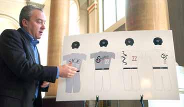
On Friday the brand new St. Joseph, Missouri entry in the independent American Association announced their nickname and introduced their logos and uniforms. The St. Joe Blacksnakes will take the field on May 19th, and if the picture above is accurate, they might wear the worst uniform in the history of baseball.

First of all, I love the name. It is a great example of a name that is both historically meaningful and extremely marketable. The nickname Blacksnakes comes from the Blacksnake Hills Trading Post which was founded in the early 1800's and later became the city of St. Joseph. Obviously, the name has more than one meaning and the second half of the meaning, snakes, is presented prominently in the logo and on the jerseys.

Three of these jerseys look fine. You can kind of make out what looks like a really nice SJ snake logo on the white jersey on the right (no logo was available online as of this evening) and you can get a feel for what their road jerseys will look like, for better or for worse - the gray shirt with white pants combination is definitely different.

But take a look at the white jersey in the middle with the snakes slithering down the front. What is that? That's not a baseball jersey, that's a really cheap t-shirt you buy at a zoo. You wouldn't even see a slow-pitch softball team wear a jersey that lame. Let's hope that this is a picture of the rejected jersey designs and the Blacksnakes will sport a more traditional look on the field to match their smart and classy nickname.

Labels: ,