
Vancouver Canadians
 Simplicity goes a long way with me. I think that baseball logos were much better and had a lot more character when teams were forced to be creative with just two letters of the alphabet rather than employ a crack staff of artists at a moments notice. What are the timeless baseball logos? "NY" on the Yankees caps, "D" for Detroit, "B" for Boston and going more modern the "A" with a halo for the Angels. It's very easy to forget some of the gimmicky mascot logos, but classically styled letter logos never go out of style.
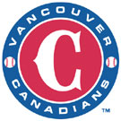
So when I saw the Vancouver Canadians new logo for this season I was very happy. The Canadians have always done a good job of keeping their logos fairly simple and dignified but their last logo was a modern looking "VC" that never really looked right. Something about it made it look top heavy and awkward. Now they have a simple looking "C" on their home hats and a "V" on their road and both look very classy.
And the decision to use and embrace just the letter "C" on the logo makes perfect sense. The Canadians have been known throughout their existence in Vancouver as simply the "C's". In fact, when I went to my first game up there I had to stop and ask directions to the ballpark and I referred to the team as the Canadians. The guy was a bit confused, because any game up there is a Canadian's game. But he finally said "oh...You mean the 'C's'!" and sent me on my way.
So kudos to the Canadians for giving us a classic and dignified new logo to go with your classic and dignified jewel of a stadium in your classic and dignified city.
Labels: Baseball, British Columbia
posted by Brandon @ 11:11 AM
![]()
![]()


0 Comments:
Post a Comment
<< Home