Tuesday, October 03, 2006

Atlanta Krunk Wolverines
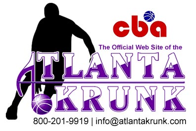

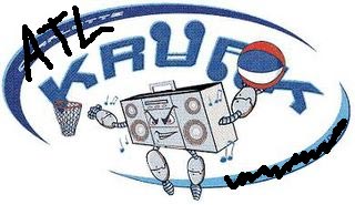
I love ragging on the Charlotte/Atlanta Krunk although I have to give it to them, the logo is looking much better. Still not very good, but at the very least, it's now presentable.

Now, if you are a little confused about the Wolverines part of their name, so am I. Apparently they will be known as the Atlanta Krunk Wolverines, in honor of their home court at Morris Brown College. Actually, from what I read, in honor is a nice way of saying they bought Morris Brown's old basketball uniforms and they happen to say Wolverines on the front of them, hence the new nickname. However, the website and the new logo don't mention the Wolverines, so where do we stand?
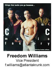
But there is some even bigger news to be had on the Krunk website. Maybe he has been a part of the team the entire time and I just didn't notice, but C&C Music Factory leader Freedom Williams has signed on as the team's Vice President. Talk about something that makes you say hmmmmm... (I sincerely apologize, I am ashamed).

And here I thought that the Hollywood Fame was the most star studded minor league basketball team that may or may not play this season. Spyder Hughes AND Freedom Williams? I for one cannot wait for the halftime shows or when Zelma Davis lip synchs Martha Wash's version of the national anthem. Now that is going to be Krunk.

Labels: ,


Thursday, August 10, 2006

Atlanta Krunk

I have good news and I have bad news.

The good news is that the Charlotte Krunk, arguably the worst logo reviewed so far on The SLP, are no more. In fact, they folded in December, playing a whole ten games in their inaugural ABA season.

But here's the bad news: It's obvious that the once somewhat respectable CBA is desperate for teams because Spyder D and his Trinity Sports & Entertainment Group have resurrected the Krunk in - surprise, surprise - Atlanta or the ATL or Hotlanta or whatever name they are using for that overrated southern crap hole.

They haven't released a new logo for the team yet so I took the liberty of updating the Charlotte Krunk logo to reflect their new home...

Spyder, if you are reading this, please feel free to steal this logo. It lives up to the high artistic standards of the original logo and apparently, it fits your price range. Just don't tell anybody where you got it. I can't have that blood on my hands.

By the way, I have been very harsh on the ABA and after reading this article, I feel vindicated. The ABA is, at best, a big joke. At worst it is a massive scam perpetrated by Joe Newman. Either way, I don't understand why anybody is still buying into this league.

Labels: ,


Thursday, March 30, 2006

Hillgrove High School Hawks


One of the weirdest things happened the other day. Someone in the industry actually valued my opinion.

Doug, a graphics designer from the ATL (I'm so hip), emailed me and asked if I would critique the logo set that he designed for Hillgrove High School, a new school set to open next year in the Atlanta area. I explained to him that although I play an expert on the internet, I am far from one in reality. And yet, he still wanted my opinion.

When I first saw the email I hoped and prayed that I would like the logo set because if I didn't, I would have a hard time saying so. I'm good when I can rip on someone that I don't know, saying it to someone personally is a different story. I am what you call, a wuss.

Thankfully, I really liked all of the logos. They are classically simple and elegant but also display a very contemporary and interesting style, which is exactly what I like in a logo.

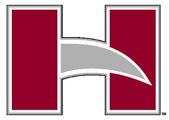
The block letter "H" is the primary logo for Hillgrove. I like it because it takes three very basic shapes and makes them look animated and exciting. Anybody can make that happen with more complex characters, but to be able to do it with just three basic shapes is impressive. My only small critique is that I would have liked to see a thicker black outline to match the rest of the logos.


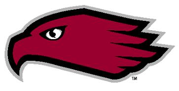
The hawk head logo is the primary logo for Hillgrove's athletic program. Again it is very simple but still modern. But for whatever reason, something doesn't completely work with this logo for me. I think it is because the eye looks so passive. I'm happy to see that it isn't a snarling, overly angry hawk but I wish it was a little more emotive. In the very large, PDF version that he sent me you can see some extra detail that makes it look much better. But in a smaller size, it loses something.


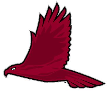
My favorite logo is their secondary athletic logo. The full size hawk is incredible because of how it gives you a sense of how majestic the hawk is without overdoing it. Because it is so simple with just a silver and black outline and different shades of red inside, it has an abstract feel but still looks strikingly like a hawk would look if you saw it in the wild.

I think Doug did an excellent job with these logos and Hillgrove High School should be proud of their new identity. They are going to be the classiest looking punk ass teenagers in the ATL.

If anybody else wants an honest opinion from a sports logo novice, please email me at downwithpants@gmail.com and I would be happy to give you my unprofessional opinion.

Labels: ,