Hillgrove High School Hawks
One of the weirdest things happened the other day. Someone in the industry actually valued my opinion.
Doug, a graphics designer from the ATL (I'm so hip), emailed me and asked if I would critique the logo set that he designed for Hillgrove High School, a new school set to open next year in the Atlanta area. I explained to him that although I play an expert on the internet, I am far from one in reality. And yet, he still wanted my opinion.
When I first saw the email I hoped and prayed that I would like the logo set because if I didn't, I would have a hard time saying so. I'm good when I can rip on someone that I don't know, saying it to someone personally is a different story. I am what you call, a wuss.
Thankfully, I really liked all of the logos. They are classically simple and elegant but also display a very contemporary and interesting style, which is exactly what I like in a logo.
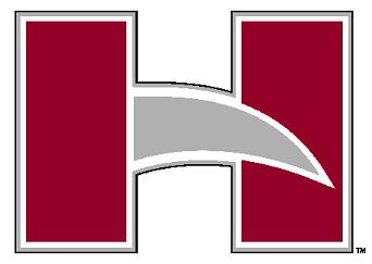
The block letter "H" is the primary logo for Hillgrove. I like it because it takes three very basic shapes and makes them look animated and exciting. Anybody can make that happen with more complex characters, but to be able to do it with just three basic shapes is impressive. My only small critique is that I would have liked to see a thicker black outline to match the rest of the logos.
Doug, a graphics designer from the ATL (I'm so hip), emailed me and asked if I would critique the logo set that he designed for Hillgrove High School, a new school set to open next year in the Atlanta area. I explained to him that although I play an expert on the internet, I am far from one in reality. And yet, he still wanted my opinion.
When I first saw the email I hoped and prayed that I would like the logo set because if I didn't, I would have a hard time saying so. I'm good when I can rip on someone that I don't know, saying it to someone personally is a different story. I am what you call, a wuss.
Thankfully, I really liked all of the logos. They are classically simple and elegant but also display a very contemporary and interesting style, which is exactly what I like in a logo.
The block letter "H" is the primary logo for Hillgrove. I like it because it takes three very basic shapes and makes them look animated and exciting. Anybody can make that happen with more complex characters, but to be able to do it with just three basic shapes is impressive. My only small critique is that I would have liked to see a thicker black outline to match the rest of the logos.
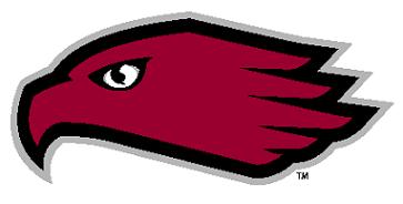
The hawk head logo is the primary logo for Hillgrove's athletic program. Again it is very simple but still modern. But for whatever reason, something doesn't completely work with this logo for me. I think it is because the eye looks so passive. I'm happy to see that it isn't a snarling, overly angry hawk but I wish it was a little more emotive. In the very large, PDF version that he sent me you can see some extra detail that makes it look much better. But in a smaller size, it loses something.
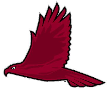
My favorite logo is their secondary athletic logo. The full size hawk is incredible because of how it gives you a sense of how majestic the hawk is without overdoing it. Because it is so simple with just a silver and black outline and different shades of red inside, it has an abstract feel but still looks strikingly like a hawk would look if you saw it in the wild.
I think Doug did an excellent job with these logos and Hillgrove High School should be proud of their new identity. They are going to be the classiest looking punk ass teenagers in the ATL.
If anybody else wants an honest opinion from a sports logo novice, please email me at downwithpants@gmail.com and I would be happy to give you my unprofessional opinion.
I think Doug did an excellent job with these logos and Hillgrove High School should be proud of their new identity. They are going to be the classiest looking punk ass teenagers in the ATL.
If anybody else wants an honest opinion from a sports logo novice, please email me at downwithpants@gmail.com and I would be happy to give you my unprofessional opinion.
Labels: Georgia, High School
posted by Brandon @ 11:37 PM
5 comments