Tuesday, May 01, 2007

Outer Banks Daredevils


Since sometimes it seems like I have nothing nice to say about the world of sports logos and instead of going negative like I easily could do given all the news coming out of the USBL and the IBL, today I bring to you one of my all-time favorite logos: the Outer Banks Daredevils. .

There is so much that I love about this logo, I don't even know where to begin. So instead of trying to figure out why I like it so much or over analyze it's merits, I'll just present it to you, in all of it's glory, and let you decide whether or not I am right to include it in my top ten best baseball logos.

Team: Outer Banks Daredevils
League: Coastal Plains League
Location: Kill Devil Hills, North Carolina - 5,897 citizens strong
Stadium: First Flight Baseball Complex
Merchandise: Most everything is sold out right now

Labels: ,


Wednesday, April 04, 2007

BREAKING NEWS - Charlotte Bobcats Sold

CHARLOTTE, NC - Charlotte Bobcats owner Robert Johnson surprised everybody in the organization by announcing that he has sold the team to a Charlotte based group including former C&C Music Factory singer Freedom Williams, according to a source close to the team. The announcement was made at an emergency all staff meeting late Wednesday night. The official announcement will be made at a press conference that has been scheduled for 9:00 AM tomorrow.

The source within the organization also reports that the new owners will be wiping out any and all references to the current ownership group including a nickname change. It has been widely speculated that owner Robert Johnson named the team the Bobcats after himself. The new owners have already been granted permission by the NBA to change their name immediately to the Charlotte Krunk, resurrecting one of the most beloved nicknames and logos in the history of the ABA.


It is also being reported that this news is just an April Fools Day post that influential sports logo review superblog, The Sports Logo Pundit, never got around to writing on Sunday.

"It's a shame too," said Brandon from his home on Wednesday night. "If I would've taken a little bit of time that day instead of hanging out with the wife, the joke would have been way funnier and much better written. Now it's just lame."

Robert Johnson was too busy allowing BET to ruin hip-hop to return any of our calls about this story.

Labels: , ,


Tuesday, February 27, 2007

Methodist University Monarchs


A big thank you goes out to Jamie for suggesting that I review Methodist University's new athletic logos and for his very kind compliments. I think that this suggestion gives me a good opportunity to share with you the process that I use to determine whether or not I like a logo.

I first saw the Methodist University Monarchs logo on the Sportslogos.net forums a couple of months ago. There it was being picked apart piece by piece (as is nearly every new logo released) by the professional designers and largely amateur sports logo nerds (I say that in the most loving way possible) that populate that board. Some of them took issue with some of the technical aspects of the design, particularly with how the crown sits on top of the head.

While I don't have any kind of background in art or graphic design, I can see some of these flaws, the crown does seem a little awkward. But this isn't how I determine what I like and don't like for The Sports Logo Pundit. My process consists of two or three simple questions:

"Would I buy a t-shirt or hat with that logo on it?"

"If I were a fan of this team or an alum of this school, would I be proud of this logo?"

And, if the logo is an update or upgrade from an old logo:

"Is the new logo an improvement?"

From there I examine the circumstances of the logo more closely and ask some more questions, but usually my opinion comes down to those first three questions.

So, let's use this criteria for the Monarchs logos. Put any of these logos (click here to see the whole package) on a green t-shirt or hoodie and I would most definitely buy one. And if I went to Methodist, I would be very proud of this logo especially since it is a major upgrade from the numerous and seemingly random Methodist logos of the past. It's an interesting and striking new identity for an institution that made a major transition going from Methodist College to Methodist University earlier this year.

Sure it's got a couple of technical issues that graphic designers and sports logo nerds will find issue with, but for the average fan (myself included) it's a solid effort from a school that we probably wouldn't have even noticed otherwise.

Team: Methodist University Monarchs
League: USA South Athletic Conference
Location: Fayetteville, North Carolina
Facilities: I love it when schools post pictures of their facilities

Labels: ,


Monday, August 22, 2005

Charlotte Krunk

First of all, sorry about the extended layoff. I had to take a step back from sports logos just for a minute and catch my breath. Don't really know why, just didn't feel like writing any logo reviews. It happens.

Recently I have been pondering the existence of the California Eagles of the ABA here in Ventura, California and I started to think about how this area has a professional sports void. There isn't a single professional franchise in Ventura County or even in Santa Barbara County despite it's size and affluence. The Eagles could possibly find a niche in this market if run right and could ultimately help someone in this county decide to build a suitable home for a professional sports team.

This made me think long and hard about how the ABA may not be all that bad. It does give people an opportunity to own a professional sports franchise and run it with extremely low costs and lets them see what they can do. I started thinking that maybe these owners aren't ridiculously stupid, like I've previously thought, throwing their money at a bunch of shysters for absolutely no payoff. I really started to think the ABA could become a model for other professional sports leagues in the future.

Then I was knocked back to the sad reality of what a joke the ABA is when I saw this logo...

Disband the ABA now! Any league that would allow a team to be called the Krunk and have a logo this unprofessional should immediately be seized by the authorities and turned over to somebody who actually knows what they are doing.

Seriously, the Charlotte Krunk wouldn't even be an acceptable name for a fantasy league team. And the logo? Well, I can't find the proper words to describe just how horrible this logo is. Let me just put it this way...I think I drew that on a pee chee or my school binder during my Electric Boogaloo stage when I was seven or eight years old. I thought I had lost that pee chee years ago, but apparently the Krunk's owner, Spyder D, found it floating around somewhere. I would want some royalties, but I am too embarrassed to claim that that was my artwork even though I was in the second grade when I drew it. It is still too shameful.

Labels: , ,


Thursday, June 23, 2005

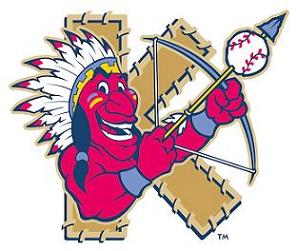
Kinston Indians


Today's random review is of the Kinston Indians of the Carolina League. Apparently political correctness hasn't affected life in Kinston too much. Actually, maybe it's common sense that hasn't affected life in Kinston. The Kinston Indians logo, in my opinion, comes in a close second for "worst example of racism toward Native Americans in sports" barely missing out on the top spot to the Washington Redskins use of the word "Redskin". But at least the Redskin's logo is pretty innocuous.

Now I really am not that big of PC guy. I like to be respectful and mindful of the feelings and issues that surround these kind of topics but I also feel that there are some people who are too sensitive for their own good. I would actually defend the use of words such as Indians, Illini, Braves, Seminoles, Warriors or whatever as team names. Usually the intent is not to degrade or harm these groups with these simple names. To have teams named for your group or tradition should be considered an honor if it is handled right.

What I mainly oppose is the use of images, like the Kinston Indian logo, that portray any racial group in such a stereotypical fashion. I also oppose the bastardization of traditions and symbols by teams. What I'm talking about here is something like the dance that the "Chief" at Fightin' Illini does at games. It's an insult to the area's Native population because it is supposed to emulate a dance that is very sacred to these people. Or the stupid tomahawk chop and chant that the you hear at Atlanta Braves games. Besides being really lame, it's also very degrading and insulting.

There are some logos that are well crafted that honor rather than degrade and I have no problem with these. Like the Florida State Seminoles for example. The Seminole Tribe has routinely backed the University and given them their blessing to use the name and their traditions and both parties seem to understand and respect each other.

But it's logos like the Kinston Indians that continue to cause problems and attempt to bring down harmonious relationships like FSU and the Seminole Tribe. This is a logo that has to go regardless of it's intent or history. It's a relic of a much more close-minded time gone by and should be retired right now. Or is that much more close-minded time still alive and kicking in Kinston?

Labels: ,