Thursday, April 28, 2005

Southwest Louisiana Swashbucklers


While searching for a schedule for the new Everett Hawks football team I just happened to notice the Swashbucklers name at the top of the National Indoor Football League's homepage and had to see the logo. I love skulls and crossbones and all of that pirate crap and I thought the
Southwest Louisiana Swashbucklers would probably be right up my alley.

The primary logo is pictured on the right and it's alright. It's a very simple logo that looks like it would probably be better suited for a baseball team. In fact, I've been racking my brain and searching the internet to find a logo for a baseball team that looks very similar. I can't seem to find it anywhere and it's starting to drive me crazy. I want to say that the team was called the Sultans but I'm not totally sure. If anyone knows, please leave me a comment.

The other logos and accoutrements on the Swashbucklers website are what I like. For example, the skull and swords at the top of this post with the lacing down the head. Classic! Nothing says pirate football like that. There's also a t-shirt on the website with a very poorly drawn skull and crossbones that looks more like a gorilla head than a pirate. But it's still pretty menacing and perfect for fans of indoor football.


Plus the team's fan club is called the Scurvy Dogs. You gotta love that.

UPDATE!!!!!!!!!!! - Of course as soon as I published this, I found the logo I was talking about on Logo Server. It's the Springfield Sultans of the Midwest League. It's not really that similar but it's no wonder that the Swashbucklers logo reminded me of it.


Labels: ,


Monday, April 25, 2005

Battle of the Week - New NFL Jerseys

First of all, I want to thank Frinklin and Rocket Jones for giving me a mention and a link on their fine blogs - Thanks guys, your support is greatly appreciated!

Next I want to thank everybody who voted in the last Battle. The Rose City Rollers dominated. Hooray for the Northwest for spawning the two best logos of all the Roller Derby leagues nationwide.

Finally, again I want to thank Frinklin for pointing out that the Detroit Lions have committed a crime against football by introducing a black alternate jersey to be used this season. They had gone away from their classic jerseys either last year or the year before but now have taken it to a new level of merchandising hell. Add that slap to the awful new uniforms that the Arizona Cardinals introduced the other day and overall it was a bad week for NFL traditionalists everywhere.

Which begs the question...Which NFL team, Detroit or Arizona, committed the biggest atrocity with their new jersey design? Voting is now open on the right hand side of the page so please vote early and often.

Labels:


Wednesday, April 20, 2005

Cardinals New Unis


Give it up for fashionable males Marcel Shipp and Josh McCown!

The Arizona Cardinals rolled out their new uniforms today. It is the first time they have changed the basic red uniform since 1901, according to this article (the quote is also from there). There was a lot of praise from the players who did the modeling...

"Anything was better than the old ones," defensive tackle Darnell Dockett said. `"Uniforms don't make the player, the player makes the uniform. But this is a good chance right here, as far as the offseason workouts are going on, we're wearing our new uniforms and we're ready to take the team to another level. It feels real good to be a part of history."

I would just like to remind everybody at the Cardinals one thing. To present these new uniforms you had some of your top players model them including Marcel Shipp and Josh McCown. Let me repeat the important parts of that sentence...your top players...Marcel Shipp and Josh McCown. You might not want to get ahead of yourself Darnell.

Besides, the Bidwells still own this franchise right? Oh yeah, success is only a uniform change away.

Labels: ,


Sunday, April 17, 2005

UC Santa Barbara Gauchos


First of all, to some of the regular readers of the Sports Logo Pundit, please let me apologize. I'm getting married in three weeks and we are into the real meat of the preparation thus drastically cutting into my blogging time. Sorry about the lack of updates, things will get better at some time. Of course, after I get married we head out on our honeymoon and then my wife will graduate from medical school and then we will be moving to Ventura, California so don't really expect too much out of me until we get down to Southern California.

Which brings us to today's logo. Ventura is located about 20 minutes south of Santa Barbara and, after reading up on the subject, UC Santa Barbara appears to be the closest Division I college to my new home. So, by default, I'm going to be a big fan of the Gauchos. Not that that's a bad thing. It looks like UCSB has some great facilities and devoted fans and really, thats what's important.


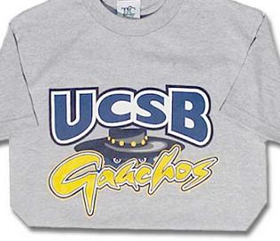
But let's be honest, this logo is iffy at best and my new found love for UCSB is hindered a bit by it. I think the name Gauchos is great but such a unique name deserves a better logo. Something more dynamic, something more exciting, something more....well, just something more, like a body for instance.

Oh who am I kidding? I'm a huge college basketball nerd and when the Cal Poly Mustangs or UC Irvine Anteaters (now that's a great name!) come rolling into town I'll be right there with the rest of the Guachos Locos with this lame logo emblazoned across my chest. Go Gauchos!

By the way, I stole this picture from UCSBStuff.com which has a really large selection of UCSB merchandise including a replica basketball jersey. I've been looking for smaller colleges that sell their basketball jerseys online and this is one of the first ones I've found. If you know of anywhere else to find small college basketball jerseys or baseball jerseys, please let me know. I found a great place to find small college football jerseys, Athlete-Tech.com (which is where I got my Bowling Green football jersey from and you could pick up your Indiana State or William Jewell jerseys from) but basketball and baseball jerseys seem to be more elusive.


Labels: ,


Tuesday, April 12, 2005

San Luis Potosi Tuneros

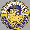
I found this logo for the San Luis Potosi Tuneros of the Mexican Baseball League while surfing around on OurSportsCentral this evening and I've been trying to figure out what Tuneros means ever since. Can you tell what it is by just looking at it? I sure as hell can't.

I first thought maybe it was a waffle but that didn't seem to make any sense. Could it possibly be a bathmat? Cheddar Cheese? A really bad infection?

Apparently it's none of these things. After a Spanish to English dictionary proved ineffective I just happened to click on a stats page on the Mexican League website and I finally got my answer. Tuneros means Cactus Pear Growers in English.

That sure is one ugly cactus pear grower. Although I can see how this "cheesy" logo might be pretty "infectious". Ha ha!

Labels: ,


Friday, April 08, 2005

I Miss The Kingdome

Sitting around my parent's house tonight in Olympia I started flipping through a book that was purchased for me about the building of Safeco Field. In the book were numerous shots of the long gone Kingdome and I started to realize just how much I miss that old concrete hunk of junk.

Safeco and Qwest Fields are both very nice facilities and I guess it's good that we have them but they both represent new Seattle, which isn't really the Seattle that I grew up with. They are both slick and bright and clean and feel extremely gentrified much like the rest of city has become.

I always loved the dirty feeling of the Kingdome. It was burly. It was gray. It was a bit depressing. But it felt like it was part of the city - a city which at times can be pretty burly, gray and depressing. It fit in like almost no other building did. Some people say that it stood out like a huge pimple on an otherwise unblemished face. I always thought of it more like Cindy Crawford's mole. An imperfection that helps make it even more perfect.

The new stadiums don't give me that feeling. Despite being right downtown they both feel like they belong out in Redmond or Lynnwood. They feel downright suburban, more mall-ish than anything. They feel like a tourist trap like Pacific Place rather than the cold reality of south Pioneer Square, the International District, SoDo and Seattle in general.

I know that my reaction to these buildings is simply based on personal experience. I grew up with the Kingdome and some of my fondest memories as a child came there. I have had some good times at Safeco and Qwest Fields but nothing can compare with those childhood memories. Not even winning teams and championships can compare.

Oh where have you gone Jim Pressley, Greg Briley, Rey Quinones, Scott Bankhead and all my other Kingdome heroes? Not over to Safeco, they probably won't even have you. But you and the Kingdome will always have a special place in my heart, .200 batting average, big pimple and all.

Labels:


Thursday, April 07, 2005

Japan Samurai Bears


I really have to hand it to the Golden Baseball League for a job well done. On Wednesday the GBL finally announced the eighth member of their league. After the Tijuana Toros folded up shop unable to secure a lease on a ballpark, the league was left with the always chilling prospect of fielding a traveling team.

Rather than go the way that the Atlantic League and the Northeast League (now the Can-Am League) did by fielding teams of players who either were rejects from other teams or players who never even got one look, the GBL came up with a solid idea. The eighth team in the GBL will be comprised completely of Japanese players and will be called the Japan Samurai Bears.

The Samurai Bears will be managed by former Japanese League great Warren Cromartie. For a team comprised of all Japanese players, getting Cromartie, who still is one of the most popular players of all time in Japan, has got to be considered a coup. I'm sure it gives the Samurai Bears instant credibility in the mind of any Japanese player thinking of playing for this team. Plus, Cromartie already understands the differences between Japanese players and American players and should be able to get quite a bit out of his team that an American coach probably wouldn't have been able to get.

Whether or not this idea works remains to be seen. We first have to wait and see if the idea of the GBL in general will work or not. But at the very least this league has really made an attempt at success and this novel idea for their traveling team makes me think that the founders of this league have got their ducks in a row and are willing to take whatever steps they need to take to make this league work. Every other league has just written a team like that off and made no attempt to make them an integral part of the league like the GBL has with the Samurai Bears.

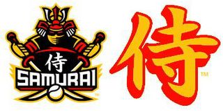
Now, on to the logo. Again my hat goes off to the GBL for this one. They have managed to top every other team in the league with these two logos. If you are going to have an all Japanese team you might as well play it up to the fullest and the Samurai Bears do exactly that.

I'm a little confused as to why the word "Bear" is in their name but I might be ignorant and am missing the reason somewhere. Also, if you go to their website you will see a lot of the stereotypical "Chop Suey" style writing that I more associate with crappy Chinese restaurants like the China Clipper in downtown Olympia. Otherwise the GBL has done an outstanding job with this team from the very idea behind them all the way down to the logo.

Labels: ,


Tuesday, April 05, 2005

The Bigger Dance

It's a totally ridiculous and sexist exercise, but who really cares! SportsRadio KJR in Seattle each year has the Bigger Dance, a tournament featuring 64 actresses, models and women's sports stars in a competition to decide who is the "Queen of the Hardwood" (get it, hard wood, pretty clever!).

It's a pretty fun little competition plus it has one of the absolute best grand prizes ever. Two roundtrip plane tickets, hotel and two tickets to any sporting event in the world. Filling out the brackets is worth it just for the chance at winning that prize.

If anyone signs up please leave me a comment (include your email in the email field) and let me know and I'll invite you to join my DOWN WITH PANTS!/Sports Logo Pundit pool. Click here to go to the brackets.


Monday, April 04, 2005

Battle of the Week (Or Three)

Voting has finally closed (after three weeks) on which Rat City Rollergirl team has the best logo. And the winner is....with 142 votes....Grave Danger! Of course I have heard rumblings about some voting irregularities and possible fraud but this isn't a Washington State Governors election, there will be no recount. The wrong candidate may have won this time around, depending on how you look at it.

Proving that I'm not above pandering, this week's Battle of the Week is "Which Roller Derby League Has The Best Logo?" I narrowed the field down to six possible contestants and came to realize that the Rat City logo is far and away the best logo currently in Roller Derby. So I eliminated it from contention. It is in another league altogether.

So instead we have five worthy contestants and they are (from top to bottom): Gotham City Roller Derby, Dallas Derby Devils, Rose City Rollers, Rocky Mountain Rollergirls and the Atlanta Rollergirls. Voting will be open for a week (or more, depending on how lazy I get).