
Lancaster JetHawks

As I mentioned last night, the Lancaster JetHawks introduced their new logos and identity package yesterday.
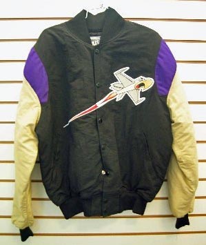
One of the basic criteria I use when I judge a redesigned logo is simply, is it an improvement over their previous logo? And in the JetHawk's case, the answer is a resounding yes. Actually, I really liked one of their logos, but when it was stripped down and turned into a cap or a jacket, it was pretty pitiful, bordering on horrible.
The new logos have some problems. In particular, the hawk itself and that funky eye. Because of the eye and the aggressive angles, the hawk doesn't have any life. It looks more like a statue than anything, maybe taxidermy. But at the same time, it goes great with all of the other elements of the logo because of how aggressive and sharp everything is.

But I don't see why they need to put different versions of basically the same thing on the caps other than to cash in on people who can't decide between the two logos. I'm sure I just answered my own question, but I think it would've been much more cohesive had they chose between one or the other for both of made one of them totally and completely different than the others.
At times, I think that these new packages give too many alternate options (see the Lehigh Valley IronPigs) and I think this is a case where it would've been better to stick with a primary logo, one cap logo and maybe a sleeve patch.
But again, anything over this is an improvement. Despite my quibbles with the logos, overall it's a very successful redesign that the JetHawks and the Antelope Valley can certainly be proud of. Now let's get out there and start selling some tickets and improve that game day experience.
Team: Lancaster JetHawks
League: California League
Location: Lancaster, California
Stadium: Clear Channel Stadium
Mascot: KaBoom - Although I'm assuming there will be a new KaBoom
Merchandise: Old and New
Labels: Baseball, California
posted by Brandon @ 11:14 PM
![]()
![]()


0 Comments:
Post a Comment
<< Home