
Kane County Cougars
Has it really been over a week since my last post? I don't know why, but I lose track of time with this blog. I feel like I just posted that thing about Whiskey Chimp a couple days ago. Seriously? Only four posts so far in the entire month of September? I've got to get cracking.

Luckily, I have some patient readers giving me some good ideas. I don't know if I'm going to get to them, but here's a start. Awhile back, Kevin asked me what I thought of his hometown Kane County Cougars logo. Very good question. It's a very interesting logo because of it's longevity despite it's simplicity and I really respect the Cougars for keeping it as their primary logo even after adding a fancier Cougar secondary logo a few years ago. Plus, the logo always brings up a little nostalgia whenever I see it.
I first started reading Baseball America when I was in either the seventh or eighth grade. Baseball America got me interested in baseball like nothing else did, especially minor league baseball. My favorite part of the magazine was the classifieds where a number of teams advertised their merchandise. It was here that I got myself an Albany Polecats sweatshirt, an Augusta Greenjackets polo and some other items that I can't remember anymore.
I first started reading Baseball America when I was in either the seventh or eighth grade. Baseball America got me interested in baseball like nothing else did, especially minor league baseball. My favorite part of the magazine was the classifieds where a number of teams advertised their merchandise. It was here that I got myself an Albany Polecats sweatshirt, an Augusta Greenjackets polo and some other items that I can't remember anymore.

It was also where I first saw the Kane County Cougar logo. At the time, all I wanted was funny or really unique looking merchandise, so the Kane County Cougars logo went straight out the window. But it piqued my interest because I had no idea where Kane County was. I always thought it was in the South somewhere and they played in a little tiny old stadium out in the middle of nowhere and had a very limited budget but also had the love and support of their long time fans. My perception of the team came directly from seeing this logo every single week in the back of BA. The simplicity and conservative nature just gave me that vision for some reason.
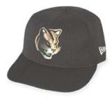
Turns out, Kane County is a suburb of Chicago. The team, stadium and logo were brand spanking new at the time and they were wildly successful at the box office. My perception couldn't have been more wrong. Since learning this, I have always felt a little ripped off. I had such a romantic notion about this team in my mind that the truth was a little disappointing. I wouldn't expect a logo like that from a new, suburban team. What I would expect is the secondary logo that they currently use on their BP caps. Now that screams suburban.
Turns out, Kane County is a suburb of Chicago. The team, stadium and logo were brand spanking new at the time and they were wildly successful at the box office. My perception couldn't have been more wrong. Since learning this, I have always felt a little ripped off. I had such a romantic notion about this team in my mind that the truth was a little disappointing. I wouldn't expect a logo like that from a new, suburban team. What I would expect is the secondary logo that they currently use on their BP caps. Now that screams suburban.
posted by Brandon @ 10:54 PM
![]()
![]()


2 Comments:
That's funny... I had the exact same reaction the first time I saw their logo! When I was 11 or 12, my grandfather gave me a Frederick Keys program, which includes the names and logos of all the O's minor-league affiliates (Kane County was one at the time; so were the Polecats, BTW.) For some reason, I thought Kane County was in Alabama or Georgia somewhere, and certainly not in Chicagoland.
So it wasn't just you. Personally, I find it a little eerie that we both made the same mistake.
You thought a team in the "Midwest League" had a team in Alabama or Georgia???
What a dumbass!!!
Post a Comment
<< Home