Worcester Tornadoes
 This morning the newest team in the Can-Am Baseball League unveiled their name and logo. The Worcester Tornadoes will begin play this summer at Fitton Field on the campus of the College of the Holy Cross and will be managed by former Boston Red Sox catcher Rich Gedman. The nickname was the most popular option in a name the team contest.
Surprisingly the name actually has something to do with the town. I really didn't think that it did at all but then I read that the name stems from a devastating tornado that struck the city in 1953. Sound morbid? Well, it is explained this way in the team's press release:
"The Worcester Tornadoes symbolize the spirit of triumph, survival and growth the city of Worcester has demonstrated since the 1953 tornado," said Tornadoes general manager Mike Lieberman. "It by no means trivializes a tragic event, but rather celebrates how the people of Worcester have prevailed and prospered in the years since."
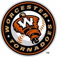
Fair enough. Now about the logo. First of all I really like the colors. The burnt orange and the beige work really well with the black. And I really like the font they used for the ring of words around the baseball. That looks great. The "W" on the tornado looks pretty good as well and if they ever just use that "W" on a hat it would look great.
However the tornado is a little weird. I like the idea of the baseball bat inside the funnel cloud but the funnel cloud itself just looks like a big band of ribbon around the bat. And it looks really flat. The baseball behind the bat and funnel cloud looks more robust and animated than the primary logo does.
It's not a bad logo by any means. Of almost all of the new baseball logos I have reviewed so far on the Sports Logo Pundit it is one of my favorites. I just wish it looked a little bit more alive and animated than it does. A tornado screams action and this logo just doesn't do that.
Labels: Baseball, Massachusetts


0 Comments:
Post a Comment
<< Home