
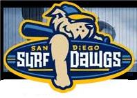
The San Diego Surf Dawgs
 Well, the Golden Baseball League has stubbed it's toe this time. Not that the previous names have been all that great or anything. They've been OK. But today the GBL announced the new name for the San Diego franchise and boy is it a doozie. Hold your breath...brace yourself...here comes one awful name...The San Diego Surf Dawgs!
Ouch! That's bad. I mean real bad. How can you be proud of a name like this? This is one of those names that just has absolutely no soul. It, like many new logos and names throughout minor league sports, sounds like it was chosen by marketers who pander to the lowest common denominator. The name was suggested by a first grader, which is great, good job to him. But that doesn't mean that it wasn't scrutinized and probed to death by a bunch of marketing whizzes who loved the edginess of the word Dawg. By the way, Does the "Dawg" remind you just a little bit of Poochie from the Simpsons.
Having voted in San Diego's name the team contest I was privy to the finalists for their nickname and now I am truly disappointed that this team didn't go with what could have been one of the best names in all of professional baseball, The San Diego Splinters. It would have been so damn good! It honors one of San Diego's true heroes, Ted Williams, and would have made for a really fun logo. It would have been a great name for both adults, who would appreciate the history of the name, and for kids at the same time. It's a shame that they ended up using the Surf Dawgs.
 And now, onto the logo. It, for what it's worth, could have been much worse and I actually like the "SD" logo with the surfboard in the background. That will look pretty good on a hat.
What I do have a problem with though is something that I have noticed in all of the recently released GBL logos. All of these logos have obviously been designed by the same graphic design company and, as far as I can tell, nobody at that company seems to be able to draw eyes. The Yuma Scorpions logo is the only living creature that has eyes, two little red ones. The Fullerton Flyers train logo, for some reason or another, has an eye. Why I couldn't tell you.
But the Long Beach Armada, the Chico Outlaws and now the San Diego Surf Dawgs logos don't have any eyes to speak of. It's very weird. Instead they all just kind of have a blank space that's supposed to be covered up by their hats. Seems like just a cop out by a bad designer to me. But who am I to criticize. I liked that crappy Splinter name over the Surf Dawgs. I guess I'm just not very hip anymore.
Labels: Baseball, California
posted by Brandon @ 11:41 PM
![]()
![]()


0 Comments:
Post a Comment
<< Home