Lakeland Flying Tigers

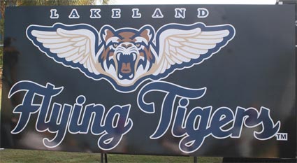
One of the first postings that I wrote here on The Sports Logo Pundit was about the possibility that the Lakeland Tigers were going to change their name to the Fish Hawks. Luckily, that name never came to fruition and the Tigers took a year to think further about their impending change. On Veterans Day they announced one of the best new names, logos and overall branding schemes to grace minor league baseball in many years: the Lakeland Flying Tigers.
Now, normally I don't go for patriotic team names or for glorifying war in any way, shape or form (I am a flaming liberal). But at the same time I respect a community's history and military aviation was and is an important part of Lakeland. Joker Marchant Stadium and Tigertown is built on the site of the Lakeland School of Aeronautics, a World War II training school. In fact, some of Tigertown's out-buildings are leftovers from the school. The name alone does great justice to that history and the rest of the package takes it to another level.
Now, normally I don't go for patriotic team names or for glorifying war in any way, shape or form (I am a flaming liberal). But at the same time I respect a community's history and military aviation was and is an important part of Lakeland. Joker Marchant Stadium and Tigertown is built on the site of the Lakeland School of Aeronautics, a World War II training school. In fact, some of Tigertown's out-buildings are leftovers from the school. The name alone does great justice to that history and the rest of the package takes it to another level.

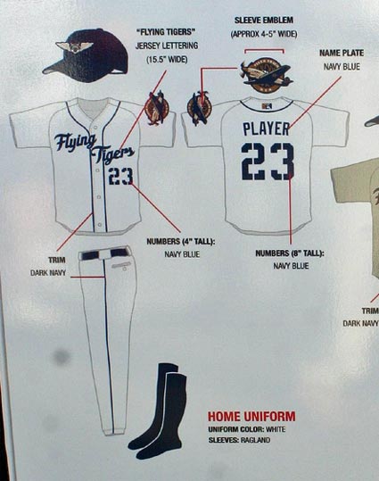
The jerseys feature one of the best wordmarks in all of baseball along with military style numbering and a sleeve patch showing a "Flying Tiger". The road jerseys are military khaki instead of gray - kind of like the San Diego Padres road jerseys but with a reason. The coaches will wear scrambled palms on the bills of their caps, which sounds weird, but looks great in the photos and the pitchers will earn stars for their caps whenever they post a win.
Round it all out with promotions all season long celebrating military aviation history including USO nights and flying exhibitions, and the fact that they didn't destroy their name recognition by dumping "Tigers" from their name and you have yourself a big time winner. Kudos to the Lakeland Flying Tigers and Plan B Branding for their excellent work on this redesign. If only more teams put this much thought into their logos.
Photos stolen from the Sports Logo Forums on SportsLogos.net and MotownSports.


2 Comments:
Most of the logos and pictures you see floating around came from longtime Lakeland fan Roger DeWitt. You can see his pictures from the unveiling on Flickr.
I have a couple photos and a little story about the name change on my site, Lakeland Local.
love the patch on uniform, not so fond of the cap...i do like the name though as it has a real ring to it.
Post a Comment
<< Home